Sara Shaw Green

The Provocateurs Cohort (Florida)

Sara Green (Florida)

In her own words:

“I live in a rural community, with mostly conservative voices at the table. While our public health and government officials carried out the duties of their elected positions, followed the guidance as issued by the governor, and heard public opinion, the majority were adamantly opposed to mask mandates, closures, and abiding by social distancing recommendations, particularly at the onset on the pandemic. There were even protests on the day of the first vote on a mask mandate in public places. The few of those who supported swifter and stricter community action were met with jeers and public ridicule.” 

“Even with this very vocal opposition, a small group of us forged ahead. Digging through the research, creating public and private channels of communication, building relationships with area public health workers and medical providers, and sharing heavily moderated (for bias and accuracy) content on social media, including statistics we garnered from public sources and our own efforts at data collection and analysis.”

“Since this undertaking our small community group has grown. Providers and health officials share testing and vaccine info to our group Facebook page, people are able to engage in dialogue without bias or motive, and we are able to share infection and mortality data, resources, and information as we become aware of it through our piecing together of information from the few available channels. While we have faced opposition coupled with alarming Covid rates, we have developed a fairly moderated, inclusive and reliable resource for our small community.”

“I say all of this to say, that any effort moving forward to harness control of the virus and repair damaged public trust, government officials would be remiss to not consider the impact these grass roots level community coalitions could play in addressing this crisis.”

A few words from those who nominated Sara:

“Over the last year, Sara has worked tirelessly to keep her community informed about the on-going coronavirus pandemic. Since July of 2020, she has voluntarily co-administered a Facebook group to share resources and updates with citizens in her rural county, with a particular emphasis on communicating factual, evidence-based information to help her neighbors make informed decisions during this crisis. Not without adversity, she has fairly and transparently enforced the rules of the group to protect her community from the rampant misinformation that has abounded in other venues of discourse. When her city council took up a local face-covering mandate, Sara called into the public meeting to advocate on behalf of the measure and encourage our local leaders to look to the scientific evidence that supported it. She has done all of this while balancing the duties of her job and her responsibilities as a mother, and she truly deserves to be recognized for her heroic work in her community.”

Click here to

Carley Fitzgerald

The Professionals Cohort (Florida)

*Acronym definitions to know: GIS (Geographic Information Science), ESRI (Environmental Systems Research Institute), WGIS (Women in GIS)

Carley Fitzgerald (Florida)

Carley Fitzgerald is a geographer and GIS expert from Highlands County, Florida, who’s dedicated, innovative and bold leadership in Florida changed how experts approached issues of geospatial epidemiology across the country.

In March 2020, Carley began working in the COVID-19 Information & Planning Section of the Highlands County Emergency Operations Center. A study released by ESRI around that time warned that Highlands was one of the most vulnerable in the nation, so Carley quickly got to work.

She worked on everything from sourcing, managing and analyzing data, to epidemiological modeling, to application development and public outreach.

“It is my hope that by providing the data, analysis, applications, and more to the County we were able to better prepare and respond to COVID-19 in our County despite our higher-than-average vulnerability to the virus,” said Carley.”

She built an application for residents to sign up for a waitlist when the state failed to provide the resources to do so, supporting her community’s access to information about vaccine distribution.

“As a geographer, I am familiar with sourcing, managing, and analyzing data,” said Carley. “I was able to quickly get to work learning GIS epidemiology models and providing key metrics regarding the status of COVID-19 in our County and State to Emergency Managers and Administration.”

Her role in managing the crisis for her community extended to advocating for data access across the country. A champion for women’s equality in advanced sciences, she was also elected to serve on the the board of Women in GIS (WGIS), an international non-profit and professional organization.

“The aim of WIGIS is to serve as a safe place for women from all geospatial fields to work towards overcoming things like: job discrimination, lower pay, professional isolation, and other common barriers women might face,” said Carley.

She currently serves as the lead for the professional development committee for WGIS, as well.

“It was especially important for me to join the organization, and now volunteer my time with WIGIS because GIS, as with pretty much most other sciences and technology fields, are very male dominated” said Carley. “Most GIS Departments are relatively small and that leaves many women in a unique position where they are the only woman in the department.”

“I worked with a colleague to develop a number of virtual events that help women in the GIS field advance their careers. We also developed a webinar series called Women in GIS Careers. We know that in a field that is male dominated representation matters and we are using the platform of our webinars to highlight successful women in GIS and their accomplishments in their field while they share how they got to their current role. We commonly speak about issues like imposter syndrome, where sometimes you just feel like you don’t belong in the role you have. Hearing these successful women speak about overcoming similar hurdles is reassuring and helps us to all know we are capable and not alone in our struggles.”

Examples of Carley’s work are submitted below.

An “At-A-Glance” Dashboard for Emergency Managers
This dashboard was created as a quick way to determine the condition in regional hospitals, our own bed availability, currently active cases and more.

Tracked Vaccine Rollout and Distribution Patterns
One of the priorities that I consider especially important for vaccine rollout are areas with high concentrations of currently active COVID-19 cases per capita. So I compare the per capita estimated current active cases for all the counties in Florida to their % of the population fully vaccinated. After highlighting the top 5 counties and Highlands in each graph you can see that they are negatively corelated. In fact, 6 of the 7 lowest fully vaccinated counties in Florida are all located in the Heartland region of Florida. Highlands County on this week was also high in concentrations of current active cases. This information is useful for advocating for increased vaccine allotment.

Weekly Trend Graphs for the County and State
These graphics were great at illustrating the progression of COVID-19 in our county and were shared at County Commissioner meetings with the public.

Tracked Hospital Bed Availability Over Time
In June I started tracking hospital bed and ICU bed availability in our county and in the state to provide a better perspective on the condition of the hospitals.

Calculated Senior Case Death and Case Hospitalization Rates for Our County and State.
Our county has consistently had a case hospitalization and case death rate that was higher than the rates of the state. This was important for future projections of COVID-19 conditions in our County. After determining an accurate case death and case hospitalization rate, I applied the CDC guidance for average time a new case takes to end up in the hospital and potentially succumb to the virus. This allowed me to project out new hospitalizations, and new deaths based on current case load.

One of the first things we knew about the virus was that it was more deadly to the older generations. I use state data to calculate how deadly by finding the case death rates based on smaller age brackets. Awareness of this metric puts just how perilous outbreaks can be in senior communities like ours.

Vaccination
I also assisted with the vaccination process by creating an online application that members of the public could register for a vaccine waitlist. In the one month the website was live before the state provided a solution to the public, is accumulated over 100,000 page views and 0ver 30,000 registrations. Not too shabby for a county that has a population of about 105,000.

Ensheng Dong

The Newcomers Cohort (Maryland)

The Johns Hopkins University COVID-19 dashboard did more to educate Americans about global health and geography than any single resource in modern history.

Ensheng Dong (Maryland)

No doubt – the student behind it changed the world.

Early in the pandemic, references to the “team” behind the project misguidedly believed an office of experts originated the project, as the workload and unique skills needed to take on such a task seemed impossible for one person, much less one student.

Unknown to most of the world was that Ensheng started the project on his own, with help from his academic advisor, Lauren Gardner.

A few words from those who nominated Ensheng:

“Ensheng Dong is the brain behind the Johns Hopkins University dashboard that put the virus in the global and geographical spotlight. He was a grad student and wanted to provide data about the virus because his family lived in Taiyuan. Without this work, who knows if we would have ever seen the virus the way we do now.””The best epidemiology model to track the COVID epidemic with the statistical tests.”

Click here to visit the Johns Hopkins University COVID-19 site.

Christian Hammond

The Professionals Cohort (California)

Christian Hammond is a software developer and founder of Beanbag, Inc. in the San Francisco Bay Area.

During COVID-19, Christian worked to build an information and data portal for his home county in California, compiling all available data into a single access point for the public.

“I grew up in Butte County, CA, and as the early surge of COVID-19 began shutting down the world around me, I started an effort to keep people back home informed so they could make safe choices. This became the Unofficial Butte County COVID-19 Dashboard,” Christian said.

“Every day, using state and local data, I update the dashboard and write reports on Facebook and Twitter for thousands of people (including educators, healthcare workers, business owners, as well as friends, family, and those I’ve yet to meet), and provide data exports for others to use. I believe it’s important for people to use whatever skills they possess to help their communities in times of need, and this is how I’m choosing to use mine.”

A few words from those who nominated Christian:

“Christian Hammond has volunteered countless hours, on a daily basis, since June 2020, to provide current and updated data for Butte County residents. He presents this data in a narrated form as well as in the form of “easy to understand” graphs, via Facebook and Twitter accounts. Like many people in my county, I view his dashboard every day to keep informed. I use this information to make decisions on how to keep me and my family safe. I have been very impressed with the research and knowledge he has imparted, and with the compassion he uses to answer his followers questions.”

“He saw a communication void and decided to fill it with reliable information. He’s also super responsive and keeps politics out of his posts for the most part. My dad emailed him a lot of questions and Christian took the the time to explain answers to all of his questions. Christian is absolutely a citizen hero!”

Click here to visit Christian’s Twitter page.

Click here to visit Christian’s COVID-19 data site.

Ignacio Handal

The Professionals Cohort (Alabama)

We are working to complete our profiles for the more than 500 nominees submitted during the month of February. If you’d like to add to this profile, please email us at: Contact@Data-Usa.org

Ignacio Handal (Alabama)

“I realized in early February of last year before there was a single US case of COVID that this would turn into a global pandemic. As a microbiologist having studied viruses in college and having done viral vector clinical research I knew that I had to get the word out,” Ignacio said.

“I used Facebook to share peer-reviewed articles and hard factual data with my community. I noticed over time that the disinformation was as strong and ubiquitous as the real information which only fortified my intrigue and cause of getting the facts out about this disease. I hope I have helped save lives and I know my wife and I have distributed thousands of masks over this last year in the spirit of community and the common good. I am a data scientist at heart and I always follow the science.”

A few words from those who nominated Ignacio:

Ignacio aka Iggy has posted religiously accurate peer reviewed information about corona virus since last February. he was one of the first to do so before anybody even really knew about Corona virus. Ignacio is a microbiologist by training and according to GlobalData.com has done more clinical research than 99.23% of all clinical researchers globally. Ignacio had diligently posted great articles to keep his community informed. many scrutinized his postings early on in January and February of last year but then it soon became clear that Corona was a real thing. He had been unrelenting helping inform his community.

Click here to see Ignacio’s Facebook page.

Dr. Bertha Hidalgo

The Specialists Cohort (Alabama)

Dr. Bertha Hidalgo (Alabama)

We are working to complete our profiles for the more than 500 nominees submitted during the month of February. If you’d like to add to this profile, please email us at: Contact@Data-Usa.org

Not one to shy away from correcting misinformation, Dr. Bertha Hidalgo has spent the last year combatting internet campaigns using misleading or false data about the effectiveness of lockdowns, masks, and vaccines.

Dr. Hidalgo, an epidemiologist and assistant professor at in Department of Epidemiology at the University of Alabama, uses Instagram, Twitter and a bit of traditional media here and there to ensure that the public has the right information, right when they need it.

Dr. Hidalgo creates simple graphics on topics from proper mask fitting to symptoms of long-haul COVID-19. She leverages the available resources around her to supplement her work, including resources from one of our other nominees, David Marconnet.

“He’s definitely provided a significant service to the state, but also a great resource that many who are working on COVID-related issues in the state can reference and use in our communication,” said Bertha Hidalgo, who has regularly shared BamaTracker updates on her social media. 

Her reach and success with communicating outside of academic (while still serving as a leader within it) helped her secure a $300,000 grant from Research Goes Red in November.

The two-year grant is aimed at increasing education and awareness in women about cardiovascular disease and stroke….and enhance the messaging about these health issues, through a public-facing awareness campaign aimed at millennial and underrepresented women to target cardiovascular disease prevention early on.

“Millennial women should care about cardiovascular health, and developing healthy lifestyles early on can make a big difference,” Hidalgo said. “We are interested in understanding what information women will be most receptive to in order to change behaviors. The end goal is helping women become more heart-aware and heart-healthy.” 

University of Alabama News, Nov. 4, 2020

A few words from those who submitted Dr. Hidalgo:

“Dr. Hidalgo has been using her social media platform (where she has 1000s of followers) to disseminate covid data and studies to lay people. She uses easy to read infographs and is everyone I knows “go-to” for evidence based covid information. Her posts are informed by the questions her followers ask.”

Click here to visit Dr. Hidalgo’s Twitter page
Click here to see Dr. Hidalgo’s Instagram

Ryan Imgrund

The Provacateurs Cohort (Ontario, Canada)

Ryan Imgrund (Ontario)

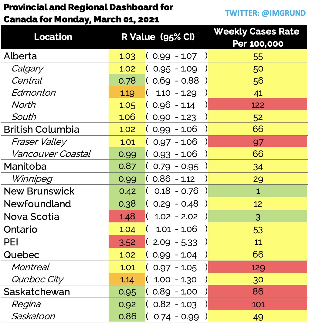
In March 2020, Ryan was a biostatistician at Southlake Regional Health Center in Newmarket, Ontario where he was in charge of creating a model to predict future ICU utilization. The one value found to be predictive in nature was the effective reproductive value (Rt). Due to Ryan’s past experience at the Public Health Agency of Canada, it was a value he was able to calculate.

In May of 2020, Ryan shifted gears when he realized that this important metric, used throughout Europe, was referred to by the Province of Ontario constantly but it’s value was never publicly released.

In the summer of 2020, Ryan extended his Rt calculations to include all 34 public health units in Ontario, Canada. This extension proved extremely beneficial when the Province of Ontario included the Rt value in their “regional framework” but still did not release the value publicly.

In the fall of 2020 Ryan departed from Southlake and started working independently. He realized the “hiding” of this value wasn’t just an Ontario problem; in fact, it happened throughout Canada. He shifted gears and started providing this value for every large Canadian province as well as all urban centers.

This value is updated on his Twitter profile (@imgrund) every morning. He has not missed a daily update since May 2020.
The value of Ryan’s effective reproductive number calculations was further elevated  when several public health units in Ontario started using both his values and his methods, including Ottawa Public Health.

Image
March 1 post on case rates and reproduction rate of COVID-19 in Canadian provinces and select cities, published on Ryan’s Twitter feed here.

“Currently, I am the only person reporting regional effective reproductive values (Rt) in Ontario, a metric that is being used by our Government to re-open our Province. No one else releases this value, not even our Government,” Ryan said. “I have expanded this and now release the Rt for EVERY Canadian Province and EVERY major Canadian city – EVERY morning at 8:00 EST. I am a biostatistician, who works with several major public health units, including Ottawa, Ontario Canada, and Six Nations, an indigenous community in Ontario. My full-time job is a high-school science teacher in the Greater Toronto Area.”

Aside from publishing this important metric on a daily basis for all Canadians, he also publishes a personal risk assessment by region, school-based cases, and global case counts. He has become the go-to source for Canadian Covid content not just by the people of Canada, but by several health units including Peel Public Health and Six Nations Health Services.

A few words from those who nominated Ryan:

“High school teacher by day, also biostatistician by day, and also COVID-19 resource by day… I’m not sure how he fits it all in, but he is definitely one of Canada’s date heroes!”

Click here to follow Ryan on Twitter

Rafael A. Irizarry

The Specialists Cohort (Puerto Rico)

Dr. Rafael Irizarry (Puerto Rico)

“I am an applied statistician working at Dana-Farber Cancer Institute and Harvard University. My research focuses on applications in genomics and cancer but I have also developed statistical methods for estimating excess deaths.

“I was born and raised in Puerto Rico (PR) and all my family lives there. When the pandemic started in March 2020 I became particularly concerned about PR because, from previous experience, I knew the government had a very poor data infrastructure. “

“It was clear that tracking the situation via data was going to be key during this pandemic. As late as June the government was still not reporting key outcomes such as the number of tests performed each day, so it was impossible to fully assess the public health situation. With help from some key people in the Department of Health, I obtained access to data and built a simple public dashboard showing a test positivity rate graph.”

“This led public health officials, scientist groups, and reporters to ask questions and make requests. By responding to these requests, the dashboard eventually became very detailed. Results are automatically updated every hour and all the code and data are publicly available. This took hundreds of hours of unpaid work and writing many hundreds of lines of code and explanations, so I am particularly happy to hear of this nomination.”

A few words from those who nominated Dr. Rafael Irizarry:

“Months after Hurricane María, the Puerto Rican government insisted only 64 people had died, despite data clearly indicating the toll was higher. Only after a publication co-authored by Rafael received media attention did the government correct this. At the start of the pandemic, PR again provided little data-driven information. Rafael convinced PR to make data public then wrote over 2,000 lines of code to create a public dashboard that showed key metrics for monitoring the epidemic. Just after the dashboard’s July launch, it showed worrisome trends convincing PR to impose restrictions, likely saving 100s of lives. Unfortunately, under pressure from business, they relaxed restrictions. Scientists pointed to Rafael’s dashboard demanding this decision be reversed. Cases rose for months before the government finally listened to data and re-instituted restrictions. In January Rafael was named to a scientific advisory board, and with decisions now data-driven, cases are steadily dropping.”

Click here to visit Dr. Irizarry’s Twitter page.

Click here to visit Dr. Irizarry’s data site.