Karen Kasler

The Press Cohort (Ohio)

Karen Kasler (Ohio)

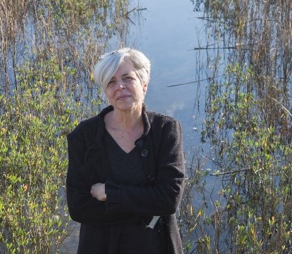
Karen Kasler manages a team of four journalists who cover the Ohio Statehouse for the state’s public radio and TV stations.

Every single member of Karen’s team was nominated more than once, a testament to her ability to not only analyze and communicate complex data regarding COVID-19, but also to build and lead a team that does data journalism right.

“The idea that I’m doing calculations and dealing with stats and data – and enjoying it – would STUN my high school math teachers,” Karen joked, noting how much work went into giving the numbers and then telling the stories behind those numbers.

She’s been tracking confirmed cases and deaths since March 9, 2020, investigating issues related to data integrity within the state. She covers everything from schools, to nursing home deaths, to vaccination issues, and changes in state policy.

She posts a data update for Ohio to her Twitter page every day at about 2 PM CT, as soon as the state’s data comes out.

“Through radio and TV stories, we’ve talked to doctors and experts about COVID deniers and nursing home staff rejecting the vaccine, to families devastated by loss and workers who can’t get unemployment benefits, and to struggling business owners and to lawmakers about public safety versus the push to “open up Ohio”.

Her stories always put data front and center, adjacent to the scientific and political voices swirling around information access and transparency.

“I’ve been tracking nursing homes for a while,” she said. “At one point, more than 70% of deaths were in those facilities. The state hasn’t made it easy because they count deaths before April 15 and after April 15 separately.”

“Since I’m a broadcast journalist, I have to make all the data simple for a listening/viewing audience. So here’s how I highlight the most important data on hospitalizations/testing/vaccines from the state’s website:”

“One other thing about Ohio,” Karen added, circling back to the issues of government leaning into anti-science radicals posing as experts or even journalists.

“While our governor was initially aggressive about shutdowns, he’s gotten pushback from his fellow Republicans in the legislature – some of whom are straight-up conspiracy theorists. They’re enabled by this guy (Jack Windsor). As the pandemic started, he ran a wedding venue. He suddenly decided he was an “investigative journalist” and infiltrated the governor’s daily press conferences – much to the frustration of actual journalists.”

Karen’s teammates who have been nominated include Andy Chow, Jo Ingles, and Dan Konik.

Karen Kasler (left), Jo Ingles (center) and Andy Chow (right) were all nominated as COVID-19 Data Heroes for their work with the Ohio Statehouse News Bureau.

A few words from those who nominated Karen and her team:

“Karen Kasler manages a team of truly talented individuals. I don’t know if she has a background in statistics or math, but she has managed to make sense of all these numbers for us. She doesn’t just throw the numbers at us like some people – she puts them in context so we understand what they mean for our lives. And she has mentored two people that could equally be considered for your award. But as the leader, you have to nominate Ms. Kasler!”

“Andy has done an exemplary job, along with colleagues Jo Ingles and Karen Kasler, providing data and analysis on the coronavirus crisis in Ohio, as well as how it affects listeners’ lives. His deep involvement with the issue has made him a trusted household name around the state.”

“Jo has continued thru her Twitter feed and on radio/television to post data and relevant news about the pandemic. I am most familiar with her Twitter postings geared toward understanding the raw data. “

Click here to visit Karen’s Twitter

Mary Landers

The Press Cohort (Georgia)

We are working to complete our profiles for the more than 500 nominees submitted during the month of February. If you’d like to add to this profile, please email us at: Contact@Data-Usa.org

Mary Landers (Georgia)

Mary Landers tackled some of the toughest issues to cover as a journalist during COVID-19 – issues of inequality that led to and exacerbated how minority communities were impacted, inequity in vaccine distribution, and racial and ethnic experiences and vulnerabilities.

“The pandemic has been data-driven news from the beginning,” Mary said. “Which states have cases, how many, what percent of the population is that, how many people have died. I’ve tried to make sense of this data at a local level when I can for our Savannah Morning News readers so that they can take appropriate actions to protect themselves. Data drives how we cover the pandemic.”

“For example, when we reached 200 COVID deaths in our county I described the demographics of those who died and profiled ten of those people,” Mary said. “Data also drives what we cover. I’ve kept an eye on issues like the settings hardest hit by COVID — prisons and nursing homes — and written local stories about outbreaks in these places.”

One of the most challenging issues Mary covered during COVID-19 related to vaccine hesitancy among Black communities in Savannah, and the dark history behind those attitudes.

A few words from those who nominated Mary:

“I believe Mary Landers is a data hero due to her diligent work towards providing the community with accurate COVID numbers. And she doesn’t stop there, she has also provided data on how Covid has disproportionately impacted black people and POC in the Savannah area. She also created data to see which zip codes were receiving the most Covid vaccines and how economically wealthier areas were receiving more shipments.”


“For the last year she has dedicated her life to providing people with Covid numbers, information, data and even helped sign people up for the vaccine herself.”

Click here to follow Mary on Twitter

Chris Vanderveen

The Press Cohort (Colorado)

Chris Vanderveen (Colorado)

Chris Vanderveen isn’t a math guy. His spreadsheets are messy, at best. But at some point, in the late spring of 2020, he found himself trying to help people who wanted more than complicated charts and numbers.

They wanted context.

In essence, they wanted to know, “What’s it all mean?”

Chris, an investigative reporter at Denver’s KUSA-TV, turned his twitter account into a daily, one-stop shop for Coloradans interested in knowing more about what the virus was up to in the state.

There, generally around 4pm, people could get info on patient counts, case counts, positivity and deaths.

With the help of his ridiculously simple graphics (arrows drawn via mouse), Chris turned the state’s daily data dump into a way for people to watch and analyze the trends. His daily updates have turned into a daily watering hole monitored by state health officials and twitter newbies alike.

On Twitter, he’s snappy and sharp. He doesn’t tolerate nonsense, and gets a lot of flack for it. He promotes science and research, and engages in discussion with those seeking answers — while shutting down those who propagate fringe ideas. With his signature red-pen, talent for graphics and video, and propensity for facts, Chris delivers information the way it was meant to be — with honesty.

A few words from those who nominated Chris:

“In Colorado, Chris Vanderveen has been my go-to. Great job reporting numbers and also providing “what does it all mean” analysis.”

“Keeps us updated with relevant rates, graphs, and context. Great resource!”

Click here to follow Chris on Twitter

We are working to complete our profiles for the more than 500 nominees submitted during the month of February. If you’d like to add to this profile, please email us at: Contact@Data-Usa.org

Megan Messerly

The Press Cohort (Nevada)

Megan Messerly’s 40th post in her weekly “Coronavirus Contextualized” series is the epitome of high-quality data reporting.

Megan Messerly (Nevada)

Whatever data is out there, Megan pulls in, analyzes and, as the title suggests, puts into context.

Her work for the Nevada Independent put her at the top of the pack in our Press Cohort, and rightfully so – her work manages to take the wealth of data that could be overwhelming and make it easily consumable, understandable, and accessible.

“It is not possible to independently calculate the test positivity rate based on test encounters because the state only reports the number of positive cases, not the number of positive test encounters,” her latest post noted. “However, the state does provide this number, calculated as an average over a 14-day period with a seven-day lag. As of Wednesday, that number was 11.3 percent, down from a high of 21.7 percent on Jan. 13. In September, before cases started to increase, the test positivity rate was 6.1 percent — meaning that test positivity is still nearly double what it once was.”

In her own words:

“In early March, when Nevada announced its first two cases of COVID-19, there was nowhere to turn for reliable data. The data lived scattered among various state and county websites and press releases.”

“So, I created The Nevada Independent’s first COVID infographic — which lived in our weekly live blogs — nearly a week and a half before the state set up its data portal. Since then, I’ve detailed and analyzed the latest COVID data in Nevada in my “Coronavirus Contextualized” series, which has published almost every single week since April 1.”

“In June, I transitioned the infographic into a full-fledged data page, which I, by myself, have updated multiple times a day, every single day, since then, including weekends and holidays.”

“I do want to give a shout out to my colleagues, who helped me with data collection for the first couple of months of the pandemic, and to our chief technology officer CJ Keeney, who helped me set up the backend of our data collection process and who is always there to answer any questions I have when something goes awry.”

View a sample of Megan’s work below

Click here to read the above article.
Click here to read the article

“To me, I think the most important part of my reporting, whether the graphics, the “Coronavirus Contextualized” series, or other individual stories I’ve written, has been providing clear information to Nevadans — not only keep them informed about the reality of the situation in our state, but to help them make educated decisions about what steps they are going to take personally to respond to the pandemic. I’m so grateful to everyone who has followed along for the last year!”

A few words from some of those who nominated Megan:

“Megan has reported our daily case, test positivity and hospitalization numbers, as well as the corresponding graphs, every day through the pandemic. She gives cliffs for every conference call of our state COVID team. She’s accessible and puts up with all the crap that the anti-maskers can give her.”

“Megan originated the “Coronavirus in Nevada” site early in the pandemic and has been the main staffer to keep this data site populated. We, as users, know that it is reliable and up to the hour with the latest data. And it’s very comprehensive, especially with the county by county statistics. Plus, her Twitter account and health newsletter keeps us informed on statements from health officials and where we can get vaccinated. Living in a rural county with no TV station, I would have felt so underinformed without her. She is Las Vegas-based, but does a wonderful job with informing residents of other counties, including little old Elko Co. where I live. And the best part is that she still maintains her beat covering politics and other health issues. A tireless journalist with a VERY appreciative Twitter following. We never want her to leave Nevada Indy, but when she gets interviewed by national media, we are reminded that someone will make her an offer she can’t refuse.”

Click here to follow Megan on Twitter

Click here to see some of Megan’s reporting.

Garrett Archer

The Press Cohort (Arizona)

Garrett Archer (Arizona)

Better known as “The Data Guru of Arizona” and “The Count of Phoenix,” Garrett Archer led the pack (or the cauldron?) as a investigative data journalist for ABC 15 News, providing frequent, transparent and accessible data and analysis during COVID-19.

Garrett’s meticulous attention to detail, meaningful analysis, and outgoing personality gained him regional and then national notoriety as an honest and data-driven reporter.

“Garrett loves nothing more than pouring over data to find a deeper understanding for stories of the day and stories that are pertinent to the community,” says his ABC 15 news profile.

Garrett quickly became one of our most frequently submitted nominees, as his work with ABC15 in Phoenix impacted the entire U.S. Southwest, where transparent data and reporting remained scarce throughout the pandemic.

He’s not afraid to call out failures or to celebrate success when warranted. And when Garrett caught COVID-19 in January, he made a point to talk about his experience publicly.

In the vaccine-rollout madness, Garrett keeps people informed of when and how Arizona and its surrounding states change the eligibility requirements:

Despite the emotional and psychological toll that comes with being a journalist assigned to cover COVID-19, Garrett brings levity into the fold as often as he can, using code and data to cheer people up.

A few words from those who nominated Garrett:

“Garrett Archer, Phoenix’s Data Guru from early on in covid has posted daily information, metrics and numbers related to COVID. His tweets have been daily and have posted current and up to date. He also has made a daily tweet showing the Navajo Nation pandemic information and is one of the few outside of the reservation.”

“Garrett has dedicated his work to sifting through AZ’s COVID data, and giving straightforward analysis and showing us trends from throughout the pandemic! I see his data as more helpful and inclusive of the pandemic, in comparison to the state’s DHS dashboard. In a world with numbers and info being flung everywhere, Garrett continues to be a warrior across all fronts, with the addition of vaccine updates in his daily drops! I think I can speak for many of the residents of arizona, by saying that his data analysis has highlighted Arizona’s successes and failings during these hard times. it’s allowed me to adjust what I’m doing in order to keep people safe.”

Click here to follow Garrett on Twitter.
Click here to see Garrett’s reporting with ABC15 News.