Matthew Holloway

The Professionals Cohort (Missouri)

Matthew Holloway received 15% of the thousands of nominations submitted. No other nominee comes close.

Matthew Holloway (Missouri)

“I do think the efforts here in Missouri have been remarkable,” Matthew said. “I certainly never intended or expected to find myself in the position I am in. When LPHAs across the state started contacting me with their numbers, I knew I’d be locked in to doing this for a while.”

“I started this project due to a lack of public communication relating to COVID-19 cases and deaths across Missouri, which were being grossly undercounted from the Missouri Governor’s office. I established relationships with administrators and leaders from health departments and hospitals across the state who were also in pursuit of comprehensive and accurate data. I provide (sometimes far too lengthy) text and visual updates at least five nights a week (7 days a week for the first 7 months) through Facebook, and have a little over 15,000 followers signed up. My goal has always been to provide the most accurate possible data in a manner that is accessible and understandable for all Missouri citizens to feel empowered to make informed decisions in the way they choose to respond to the pandemic.”

Click here to see Matthew’s Missouri COVID-19 data site.
Click here to see Matthew’s Facebook page.
Click here to follow Matthew on Twitter

While we work on getting our interview with Matthew up on the site, we’re going to let some (but certainly not all) of those who submitted Matthew do the talking:

“Not sure 1,000 characters are enough, but I’ll try: on a completely volunteer basis–and mostly on his own–Matthew has collated, organized, and shared data that would be (and should have been) the work of one or more state health departments, and has gone over and above to keep the people of Missouri aware of what’s happening in our state at a time when politics and other factors limited what was shared with the public. Matthew has done all of this while keeping a day job, having a young family, adding to that family, and experiencing his first pandemic like the rest of us. I can think of no better person for the award!!! Just go to his Facebook posts to see the time, energy, passion, and talent he’s put into this volunteer project, and you’ll see why so many people have come to rely on him to keep informed. He IS A TRUE COVID-19 DATA HERO! Now, is there an “Honorable Mention” category, because if there is, his wife deserves a lot of credit for supporting him in all this!”

“I feel like Matthew has been there for us since day one. Even though his Covid event, working a full time job, and raising a family, he has always been there! He is raw with us. Completely open and honest and someone that I felt that I could trust when there was no other site to turn to. I mean he definitely didn’t sugarcoat anything for us and that is what we needed, not only as a community or state, but a nation. We needed the facts. I could go on and on, but he simply is the best of the best! And his humor, well that helped me a many of rough nights when all the numbers were so overwhelming. Great Matthew. You should be so proud of all your hardwork and dedication! :-)”

“Matthew has single handedly created a Missouri covid information system available to his friends and followers on Facebook. As the project got more difficult he organized help from health departments. My husband is a physician running a covid unit. He knows Matthew personally and believes in his integrity. That’s all I needed to trust in him and his reporting.”

“The state of Missouri’s covid dashboard is junk. It’s thousands and thousands and thousands of cases behind in reporting the numbers to the residents of Missouri. Every night, Matthew gathers the Covid case and death data from each and every of the 117 jurisdictions in MO and compiles the info into graphics to let Missourians know what the actual Covid situation is like. The work he does is AMAZING. And he does this for free, after his day job, every single day, for almost a year now. He saw a need, and he jumped up and made a difference. He’s truly a hero.”

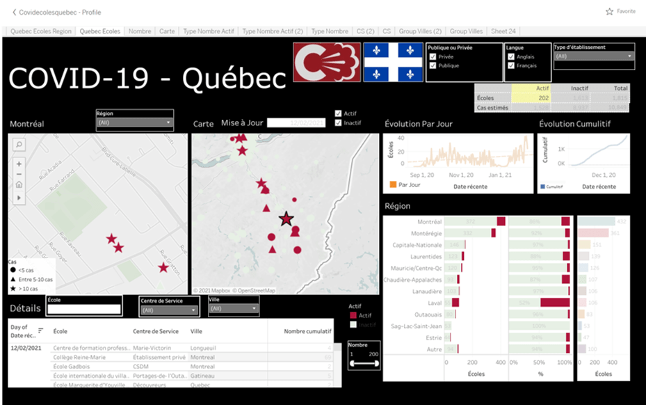
“Although I currently live in Miami Florida, Matthew Holloway lives in Joplin Missouri, which is the city I was born in. I occasionally visit Missouri, and Matthew provides me and my friends in Missouri the most complete tracking of COVID-19 infections and deaths for each of Missouri’s 114 counties, plus two other jurisdictions, including St. Louis. By providing a daily running total of new infections and deaths in each county, his updates help people to adjust their activities accordingly. He also shows the percentage of residents in various counties who have received their first vaccination and the overall percentage of Missouri residents who have received their first (12.8%) and second shots (6.6%). Matthew is very impressed with the daily communication provided by the St. Louis Metropolitan COVID-19 task force, but not as impressed with the communication that has been provided at a state level. He has attempted to compensate for this, and I think he has done an excellent job!”

“When the state of Missouri failed its residents, Matthew picked up the slack and started providing sound data and visualizations along with neutral narrative that allowed the every day person to understand the state of COVID across our state. Not only has his narrative been informational, Matthew never restricted his good humor and candidness providing none stop smiles and laughs during such a down and dark year. I should also mention that this is not his job and he purely does this out of the goodness of his heart, which speaks volumes to his character and how deserving he is this reward!!!”

“Matthew’s data has been consistent daily, since March 2020. He meticulously sources his data in a transparent way, that anyone can check, as he lists them. His graphs and information have been available to the nearby city councils, and clinics, anyone who needs data points to get across the seriousness and local statistics. This information has influenced so many in their COVID mitigation efforts and daily planning. He is courteous to a fault, with naysayers, simply acknowledging them, but not taking it personally. His facts help one weed through the misinformation and skewing of information. He gives praise where credit is due. All of this has been done as a VOLUNTEER, because of his dedication to providing this service to his community. All while raising a family and working. He also experienced COVID himself and his own family, while doing the project, and still continued data during that time when he was able. He this has immense empathy for those who have or will experience it.”

“Has taken it upon himself to be the most reliable, transparent, trustworthy source of information on COVID-19 in Missouri early 2020. I am a healthcare worker and his data has been invaluable to me at a time when so many things were unsure. I always knew I could trust Matt’s information, that it was not biased and it was the best sources. It helped me make informed decisions to protect myself, my family, and my patients.”

“I’ve been following Matthew’s Facebook posts since March or April of last year, and I immediately appreciated that he was presenting the data in a way that was much more accessible and understandable. As the summer wore on, I started following my local health department sites, so I volunteered to Matthew that I’d be happy to collect the numbers from the counties all around me. I joined his little team in September. The value of his work became even more apparent when the state data was transferred from the DHSS to an independent contractor for a hefty sum, no doubt. The numbers mysteriously started to fall way behind what our health departments were reporting. Matthew data had always been ahead of the state numbers, but now the difference was profound. I appreciate Matthew’s sense of humor, how he shares himself with us all, and how careful he is not to say anything that is too political so as not to alienate people. It’s an honor to help him. I wish his work wasn’t needed, but it is.”

Click here to see Matthew’s Missouri COVID-19 data site.
Click here to see Matthew’s Facebook page.
Click here to follow Matthew on Twitter

Micah Pollak

The Professionals Cohort (Indiana)

Micah Pollak (Indiana)

Micah Pollak still remembers his first tweet about COVID-19 data in Indiana from March 22.

Indiana launched a poorly-formatted red-dot map, with one red dot for every county that had reported cases with no other information, as the only initial public resource for the public.

“I was looking back at some of my earliest Tweets on Covid and one was something like ‘I couldn’t find the graph I wanted so I made it myself,’ and I think that captures why a lot of us got into this in the first place,” Micah said.

What the state was putting out wasn’t enough.

Micah found the data presentation inadequate, sometimes misleading, and not answering urgent, basic questions. So he started exploring data on his own and then shared his analysis on Twitter, not expecting it to pick up the popularity or following he now has.

Micah is an associate professor of economics and the Director of the Center for Economic Education & Research (CEER) at Indiana University Northwest. So epidemiology was outside of his comfort zone, he said. What he did feel comfortable doing, though, was advanced statistics and data communication about what was happening.

“With so much happening outside our control during this global pandemic, it is easy to feel overwhelmed and powerless,” Micah said. “By analyzing and reporting on COVID-19 data, with a special focus on my state and local region, I can empower people through a better understanding of what is happening in the world around them to regain their confidence and make informed decisions about their daily life.”

He’s passionate about education and serving his community, and sees his time during COVID-19 as an effort in cutting through the chaos and conspiracies to bring valuable data and analysis to the forefront.

He’d be remiss not to mention his frequent partner-in-data, Gabriel Bosslet, another one of our nominees in our Specialists group.

A few words from those who nominated Micah:

“Takes what is sometimes dry, confusing, gobblygook information and makes it interesting and easy to understand, and includes some much needed levity during these trying times.”

“The state of Indiana has not provided reliable information and Micah put everything in perspective as a parent, family member, and professional. “

Click here to follow Micah on Twitter
Click here to visit Micah’s website

Carley Fitzgerald

The Professionals Cohort (Florida)

*Acronym definitions to know: GIS (Geographic Information Science), ESRI (Environmental Systems Research Institute), WGIS (Women in GIS)

Carley Fitzgerald (Florida)

Carley Fitzgerald is a geographer and GIS expert from Highlands County, Florida, who’s dedicated, innovative and bold leadership in Florida changed how experts approached issues of geospatial epidemiology across the country.

In March 2020, Carley began working in the COVID-19 Information & Planning Section of the Highlands County Emergency Operations Center. A study released by ESRI around that time warned that Highlands was one of the most vulnerable in the nation, so Carley quickly got to work.

She worked on everything from sourcing, managing and analyzing data, to epidemiological modeling, to application development and public outreach.

“It is my hope that by providing the data, analysis, applications, and more to the County we were able to better prepare and respond to COVID-19 in our County despite our higher-than-average vulnerability to the virus,” said Carley.”

She built an application for residents to sign up for a waitlist when the state failed to provide the resources to do so, supporting her community’s access to information about vaccine distribution.

“As a geographer, I am familiar with sourcing, managing, and analyzing data,” said Carley. “I was able to quickly get to work learning GIS epidemiology models and providing key metrics regarding the status of COVID-19 in our County and State to Emergency Managers and Administration.”

Her role in managing the crisis for her community extended to advocating for data access across the country. A champion for women’s equality in advanced sciences, she was also elected to serve on the the board of Women in GIS (WGIS), an international non-profit and professional organization.

“The aim of WIGIS is to serve as a safe place for women from all geospatial fields to work towards overcoming things like: job discrimination, lower pay, professional isolation, and other common barriers women might face,” said Carley.

She currently serves as the lead for the professional development committee for WGIS, as well.

“It was especially important for me to join the organization, and now volunteer my time with WIGIS because GIS, as with pretty much most other sciences and technology fields, are very male dominated” said Carley. “Most GIS Departments are relatively small and that leaves many women in a unique position where they are the only woman in the department.”

“I worked with a colleague to develop a number of virtual events that help women in the GIS field advance their careers. We also developed a webinar series called Women in GIS Careers. We know that in a field that is male dominated representation matters and we are using the platform of our webinars to highlight successful women in GIS and their accomplishments in their field while they share how they got to their current role. We commonly speak about issues like imposter syndrome, where sometimes you just feel like you don’t belong in the role you have. Hearing these successful women speak about overcoming similar hurdles is reassuring and helps us to all know we are capable and not alone in our struggles.”

Examples of Carley’s work are submitted below.

An “At-A-Glance” Dashboard for Emergency Managers
This dashboard was created as a quick way to determine the condition in regional hospitals, our own bed availability, currently active cases and more.

Tracked Vaccine Rollout and Distribution Patterns
One of the priorities that I consider especially important for vaccine rollout are areas with high concentrations of currently active COVID-19 cases per capita. So I compare the per capita estimated current active cases for all the counties in Florida to their % of the population fully vaccinated. After highlighting the top 5 counties and Highlands in each graph you can see that they are negatively corelated. In fact, 6 of the 7 lowest fully vaccinated counties in Florida are all located in the Heartland region of Florida. Highlands County on this week was also high in concentrations of current active cases. This information is useful for advocating for increased vaccine allotment.

Weekly Trend Graphs for the County and State
These graphics were great at illustrating the progression of COVID-19 in our county and were shared at County Commissioner meetings with the public.

Tracked Hospital Bed Availability Over Time
In June I started tracking hospital bed and ICU bed availability in our county and in the state to provide a better perspective on the condition of the hospitals.

Calculated Senior Case Death and Case Hospitalization Rates for Our County and State.
Our county has consistently had a case hospitalization and case death rate that was higher than the rates of the state. This was important for future projections of COVID-19 conditions in our County. After determining an accurate case death and case hospitalization rate, I applied the CDC guidance for average time a new case takes to end up in the hospital and potentially succumb to the virus. This allowed me to project out new hospitalizations, and new deaths based on current case load.

One of the first things we knew about the virus was that it was more deadly to the older generations. I use state data to calculate how deadly by finding the case death rates based on smaller age brackets. Awareness of this metric puts just how perilous outbreaks can be in senior communities like ours.

Vaccination
I also assisted with the vaccination process by creating an online application that members of the public could register for a vaccine waitlist. In the one month the website was live before the state provided a solution to the public, is accumulated over 100,000 page views and 0ver 30,000 registrations. Not too shabby for a county that has a population of about 105,000.

Olivier Drouin

The Professionals Cohort (Quebec, Canada)

Click above to listen to our interview with Olivier Drouin!
Olivier Drouin (Canada – Quebec)

Olivier Drouin ventured into the treacherous waters of reporting cases in COVID-19 schools when Quebec dodged the responsibility last August.

Despite the lack of transparency in many schools, Olivier worked with teachers unions, parents, and schools to produce his data analysis on COVID-19 in schools.

Infectiously kind, gracious, and humble, Olivier took on the task of reporting school cases in Quebec, much in the same way The Covid Monitor did in the United States.

Drouin appeared on “The Most Fascinating Montrealer” podcast and was featured in major news outlets for his work.

A recent research paper used Olivier’s data from Covid Ecoles to examine school cases trends in Montreal, Canada, bolstering his dutiful work and giving him substantial academic cred.

“I am a team of one – single parent of two teenage daughters and VP technology for a large company in Montreal,” Olivier said. “This is volunteer work and I have spent at least 1000 hours since August 26th, 2020.”

Olivier Drouin’s website greets visitors with a pointed note:

The mission of this citizen initiative for transparency of data on schools affected by COVID is to make information available, accessible and intelligible in real time to school stakeholders (parents, teachers, staff members).

The site uses the creativity, intelligence and know-how of the community to create content, develop ideas, solve a problem or carry out an innovative project, all at a lower cost. This approach is commonly known as crowdsourcing.

The project is based on the strength of collective intelligence using crowdsourcing. The site publishes the number of schools affected by at least one positive case of COVID since August 26th.

The information comes from the public and is validated with a copy of the letter issued by public health or the school administration. This list is an evolving and non-exhaustive list. It is updated several times a day. You can submit positive COVID cases in your schools, whether you are a parent, teacher, service center employee or citizen.

https://www.covidecolesquebec.org/
Olivier’s website, CovidEcolesQuebec.org.

Drouin, who lives on Nuns’ Island, started tweeting about the pandemic in the summer, concerned about the government’s back-to-school plan. In September, Drouin founded a volunteer website, CovidEcolesQuebec.org, posting cases of COVID-19 in schools across the province, based on letters by principals sent to him from parents. The website quickly became one of the most visited in the province.

Drouin has also advocated for better ventilation in schools, including the installation of portable air purifiers in classrooms.

“Twitter has a real-time aspect to it, contrary to other social media,” Drouin explained.

Cases by grade-level groups on Olivier’s website, CovidEcolesQuebec.org

“It is easy to connect quickly on content with experts (from) around the world on a given topic. When it came time to launch CovidEcolesQuebec.org, it was simply an extension of my community involvement and I felt it was important to create a separate account to promote the site and create a community of like-minded followers that would amplify the message and help make this crowdsourcing website a success.”

All of the data Olivier collects is public and easily accessible. Click here to download the raw data.

A few words from those who nominated Olivier:

“One parent, as a volunteer work, has been tracking all Quebec Covid cases in school since August 26th, at a time when the government was refusing to disclose the data. Using crowdsourcing method, he publishes official letters sent by school and public health to parents that confirm a case and compiles it in real time on a geospatial map. He manages also a twitter account and Facebook page. he was mentioned by elected officials at the national assembly of Quebec, covered in other 200 news media articles and name Most fascinating Montreal of 2020 by CJAD radio.”

Click here to visit Olivier’s website. Click here to access his raw data and dashboard.

Click here to follow Olivier on Twitter at his personal or Covid Ecoles handle.

David Marconnet

Professionals Group (Alabama)

David Marconnet (Alabama)

David Marconnet started Bama Tracker as a side project to help Alabama citizens better understand the COVID-19 data coming from the Alabama Department of Public Health (ADPH).

Today, the site provides the most comprehensive view of COVID-19 data for the state of Alabama.

With a background in graphic and web design, David took the mess provided by the state and turned it into a data empire — one he plans to continue to build on and expand long “after” COVID-19.

BamaTracker.com has been visited by more than 1.5 million people since March 2020, and has been used by government leaders, medical professionals, teachers and many others as a source for current data and trends on COVID-19 in Alabama.

“I never imagined the impact it would have on so many people and am honored to have been able to build the site and have it become such a valuable resource,” said Marconnet.

Marconnet said one of his goals for Bama Tracker was to present the data in a way that any person could understand, so that they could better follow the course of the pandemic.

Another goal, Marconnet said, was to present the data from an apolitical viewpoint, though he quickly found out how even tweeting “Have a good weekend and wear a mask” became politically charged during the pandemic.

A recent article in the Redstone Rocket praised David’s efforts, noting:

Marconnet launched the third iteration of the website in January – with expanded data about COVID-19 vaccine efforts. He said that with the new website, “it has been an exercise in finding out what the health department cares about, what the hospitals care about, what people care about.”

The Redstone Rocket
Screenshot of http://www.BamaTracker.com

A few comments from those who nominated David:

“This resource has been my go-to for information on the pandemic in Alabama since its inception. I also deeply appreciate how David holds ADPH accountable when data is unclear, delayed, or potentially misleading.”

“From the start of the pandemic, David sought to capture state level data and feed it into visuals and models that are more readily understood by the public. His level of transparency in data reporting is outstanding. He quickly became the go-to source for individuals, local media, and scientists within the state. “

Spread the word:

@davidmarconnet, creator of @BamaTracker, is a #COVID19 #DataHero worthy of all the praise, and a finalist for the COVID-19 #DataHeroAwards. See all nominees at: DataHeroAwards.org. Check out his data resources at: http://www.BamaTracker.com