A note from the COVID-19 Data Hero Awards program organizer

Grateful.

The time I’ve spent processing nominations, interviewing nominees, writing their profiles, and working with our panel to select winners of our Inaugural COVID-19 Data Hero Awards left me truly grateful.

With the wealth of resources across the United States and Canada, from a college student tracking cases in the White House to a pediatrician developing and communicating vaccines, I can imagine no greater range of talents than those we showcase in this program.

When I made the decision to start this program in January 2021, I envisioned it as a way to build a map or master directory of sorts so that the public and other experts could learn from those who have made data communication central to their efforts during COVID-19.

While I have spoken to a handful of the people on this list in the past, and have heard of a few dozen more, even I did not appreciate how hard people from all backgrounds and levels of expertise, with limited resources or minimal notoriety, were conquering the virus in their communities through effective communication of data and science. 

As the awards portion of our program closes, our directory will continue to grow, so please nominate whoever has been a data hero for you during this pandemic for recognition on our site.

The purpose of this program has always been recognition, not competition. The awards allow us to highlight 26 exceptional data communicators and advocates, but that in no way means that every other person submitted is not equally deserving of praise.

Some of those who we considered as finalists graciously bowed out, wanting to remain in the program but yielding the spotlight to those who have been under cloudier skies. 

And while we received nominations for brave heroes like Dr. Cleavon Gilman, who lost his job for simply telling the public that Arizona had no staffed ICU beds, and devoted volunteers like those behind the vaccine-alerts.com project in Oklahoma, we tried to maintain our focus in consideration of the final awards — those who made data, data-driven analysis and science the center of their public communications.

We broke up our list of nominees into five categories. Within each group you’ll find a range of expertise, experience and personalities. We wanted our finalists to represent their peers, while acknowledging the handful who stood out among them.

In the end, the decision to select just one hero per group to recognize as a “winner” became too difficult. So for each cohort of heroes, we decided to recognize a winner, a runner-up, and all other nominees with a reward for their efforts. We also want to reward those who won the public vote through online voting, which more than 35,000 unique IP addresses cast ballots for.

Online Voting Winners:

The NewcomersRachel Woodul (North Carolina)
The PressMary Landers (Georgia)
The ProfessionalsMatthew Holloway (Missouri)
The SpecialistsDr. Emily Smith (Texas)
The ProvocateursRyan Imgrund (Ontario, Canada)

We also decided to honor three data hero nominees who have spent the last year working on COVID-19 in public service or as volunteers. 

After all awards are given, our program will give $10,000 in awards to our finalists – far beyond our original budget of $3,000, but worth every penny.

I have discovered so many amazing new people through this program, and I hope you will, too.

Congratulations to all of our nominees, finalists and winners. The community of resources built during COVID-19 should be widely recognized and celebrated for the efforts they put into this unprecedented time. 

Thank you,

Rebekah Jones

Note: All award recipients will be announced at 5:00 PM Eastern Time on Wednesday, March 31, 2021, here on our website and on Twitter.

Christian Hammond

The Professionals Cohort (California)

Christian Hammond is a software developer and founder of Beanbag, Inc. in the San Francisco Bay Area.

During COVID-19, Christian worked to build an information and data portal for his home county in California, compiling all available data into a single access point for the public.

“I grew up in Butte County, CA, and as the early surge of COVID-19 began shutting down the world around me, I started an effort to keep people back home informed so they could make safe choices. This became the Unofficial Butte County COVID-19 Dashboard,” Christian said.

“Every day, using state and local data, I update the dashboard and write reports on Facebook and Twitter for thousands of people (including educators, healthcare workers, business owners, as well as friends, family, and those I’ve yet to meet), and provide data exports for others to use. I believe it’s important for people to use whatever skills they possess to help their communities in times of need, and this is how I’m choosing to use mine.”

A few words from those who nominated Christian:

“Christian Hammond has volunteered countless hours, on a daily basis, since June 2020, to provide current and updated data for Butte County residents. He presents this data in a narrated form as well as in the form of “easy to understand” graphs, via Facebook and Twitter accounts. Like many people in my county, I view his dashboard every day to keep informed. I use this information to make decisions on how to keep me and my family safe. I have been very impressed with the research and knowledge he has imparted, and with the compassion he uses to answer his followers questions.”

“He saw a communication void and decided to fill it with reliable information. He’s also super responsive and keeps politics out of his posts for the most part. My dad emailed him a lot of questions and Christian took the the time to explain answers to all of his questions. Christian is absolutely a citizen hero!”

Click here to visit Christian’s Twitter page.

Click here to visit Christian’s COVID-19 data site.

Ryan Imgrund

The Provacateurs Cohort (Ontario, Canada)

Ryan Imgrund (Ontario)

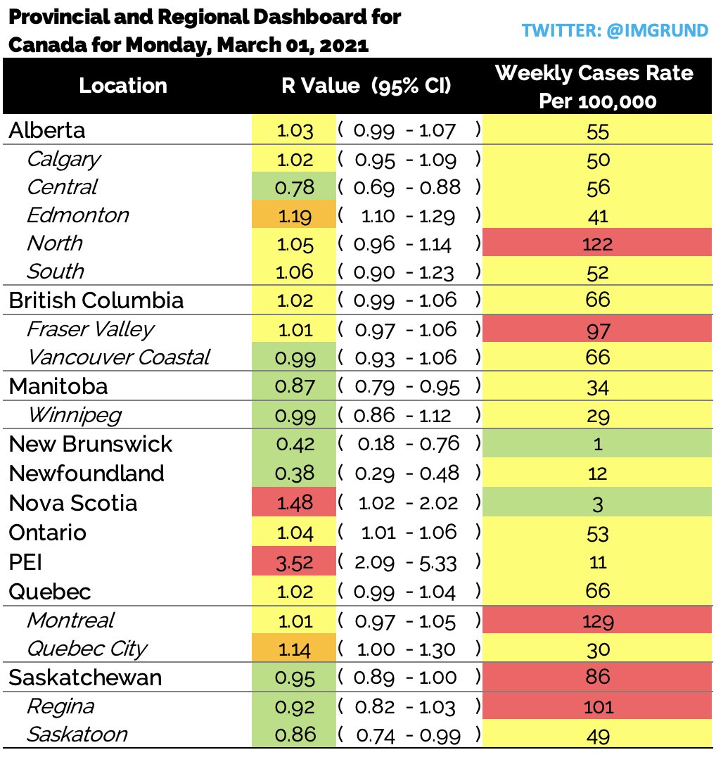
In March 2020, Ryan was a biostatistician at Southlake Regional Health Center in Newmarket, Ontario where he was in charge of creating a model to predict future ICU utilization. The one value found to be predictive in nature was the effective reproductive value (Rt). Due to Ryan’s past experience at the Public Health Agency of Canada, it was a value he was able to calculate.

In May of 2020, Ryan shifted gears when he realized that this important metric, used throughout Europe, was referred to by the Province of Ontario constantly but it’s value was never publicly released.

In the summer of 2020, Ryan extended his Rt calculations to include all 34 public health units in Ontario, Canada. This extension proved extremely beneficial when the Province of Ontario included the Rt value in their “regional framework” but still did not release the value publicly.

In the fall of 2020 Ryan departed from Southlake and started working independently. He realized the “hiding” of this value wasn’t just an Ontario problem; in fact, it happened throughout Canada. He shifted gears and started providing this value for every large Canadian province as well as all urban centers.

This value is updated on his Twitter profile (@imgrund) every morning. He has not missed a daily update since May 2020.
The value of Ryan’s effective reproductive number calculations was further elevated  when several public health units in Ontario started using both his values and his methods, including Ottawa Public Health.

Image
March 1 post on case rates and reproduction rate of COVID-19 in Canadian provinces and select cities, published on Ryan’s Twitter feed here.

“Currently, I am the only person reporting regional effective reproductive values (Rt) in Ontario, a metric that is being used by our Government to re-open our Province. No one else releases this value, not even our Government,” Ryan said. “I have expanded this and now release the Rt for EVERY Canadian Province and EVERY major Canadian city – EVERY morning at 8:00 EST. I am a biostatistician, who works with several major public health units, including Ottawa, Ontario Canada, and Six Nations, an indigenous community in Ontario. My full-time job is a high-school science teacher in the Greater Toronto Area.”

Aside from publishing this important metric on a daily basis for all Canadians, he also publishes a personal risk assessment by region, school-based cases, and global case counts. He has become the go-to source for Canadian Covid content not just by the people of Canada, but by several health units including Peel Public Health and Six Nations Health Services.

A few words from those who nominated Ryan:

“High school teacher by day, also biostatistician by day, and also COVID-19 resource by day… I’m not sure how he fits it all in, but he is definitely one of Canada’s date heroes!”

Click here to follow Ryan on Twitter

Rafael A. Irizarry

The Specialists Cohort (Puerto Rico)

Dr. Rafael Irizarry (Puerto Rico)

“I am an applied statistician working at Dana-Farber Cancer Institute and Harvard University. My research focuses on applications in genomics and cancer but I have also developed statistical methods for estimating excess deaths.

“I was born and raised in Puerto Rico (PR) and all my family lives there. When the pandemic started in March 2020 I became particularly concerned about PR because, from previous experience, I knew the government had a very poor data infrastructure. “

“It was clear that tracking the situation via data was going to be key during this pandemic. As late as June the government was still not reporting key outcomes such as the number of tests performed each day, so it was impossible to fully assess the public health situation. With help from some key people in the Department of Health, I obtained access to data and built a simple public dashboard showing a test positivity rate graph.”

“This led public health officials, scientist groups, and reporters to ask questions and make requests. By responding to these requests, the dashboard eventually became very detailed. Results are automatically updated every hour and all the code and data are publicly available. This took hundreds of hours of unpaid work and writing many hundreds of lines of code and explanations, so I am particularly happy to hear of this nomination.”

A few words from those who nominated Dr. Rafael Irizarry:

“Months after Hurricane María, the Puerto Rican government insisted only 64 people had died, despite data clearly indicating the toll was higher. Only after a publication co-authored by Rafael received media attention did the government correct this. At the start of the pandemic, PR again provided little data-driven information. Rafael convinced PR to make data public then wrote over 2,000 lines of code to create a public dashboard that showed key metrics for monitoring the epidemic. Just after the dashboard’s July launch, it showed worrisome trends convincing PR to impose restrictions, likely saving 100s of lives. Unfortunately, under pressure from business, they relaxed restrictions. Scientists pointed to Rafael’s dashboard demanding this decision be reversed. Cases rose for months before the government finally listened to data and re-instituted restrictions. In January Rafael was named to a scientific advisory board, and with decisions now data-driven, cases are steadily dropping.”

Click here to visit Dr. Irizarry’s Twitter page.

Click here to visit Dr. Irizarry’s data site.

Josh and Amanda Smith

The Volunteers Cohort (Texas)

We are working to complete our profiles for the more than 500 nominees submitted during the month of February. If you’d like to add to this profile, please email us at: Contact@Data-Usa.org

“My wife and I are veterans of the concert industry. So when covid hit, our entire world came to a halt a couple weeks before the US lockdowns started. We knew we were going to need a centralized place to stay in touch with our community, so on 3/17/20, we launched DFW Corona Connection.

“What we didn’t know was that this group would quickly became a vital resource for nearly 22,000 of our neighbors. We fact checked everything. We took it upon ourselves to share everything from daily press conferences to daily case counts to daily updates from our local animal shelters. People turned to DFWCC for just about everything. Unemployment claim not going through? We had tips to bypass the clogged up website and phone lines. Need toilet paper? You can swap supplies here. BLM Protests? We followed them all in real-time. Election? Yeah, we did some of that too. Almost accidentally, we had created an online community that mimicked the “real world.” It’s still going strong today and we plan on keeping it going even after COVID-19 is no longer the daily headline.”

A few words from those who submitted Josh and Amanda Smith:

“At the onset of the pandemic, husband / wife team Josh & Amanda Smith created an online space exclusive to the Dallas / Fort Worth community called DFW Corona Connection. They have invested countless hours rooting out misinformation, offering resources and connecting the dots between the crises we have faced while providing localized & accurate daily data throughout the last year. The group has grown to over 21,000 members of information seekers, elected officials, journalists, community leaders, small business owners, etc. The group members have come to rely on Josh & Amanda not only for accurate information, but to provide a safe space for the North Texas community to digitally connect with their neighbors. Their efforts were recently recognized in an article from the Dallas Observer: “

Click here to visit Josh and Amanda’s DFW Corona Connection Facebook page.

Jason Salemi

The Specialists Cohort (Florida)

We are working to complete our profiles for the more than 500 nominees submitted during the month of February. If you’d like to add to this profile, please email us at: Contact@Data-Usa.org

Jason Salemi (Florida)

Dr. Jason Salemi is an Associate Professor with joint appointments in the at the University of South Florida College of Public Health and the Morsani College of Medicine. He also maintains adjunct faculty status at his former institution, Baylor College of Medicine.

“I have a demonstrated record of collaborative research, scholarly publication, teaching and advising, and participation in public health organizations and professional associations” Jason writes on his website.

“I have amassed a substantial and versatile proficiency in database development, data linkage, management, and analysis, program and systems evaluation, community engagement, and information dissemination. I am a passionate public health professional committed to solving problems and creating conditions that enable people to lead healthy, productive lives.”

Jason built a reputation in Florida as an honest, transparent and vigilant reporter of data and trends through his website and Twitter feed. Jason makes all of his data available to the public for free, and has invested countless hours in keeping Florida honest, never deterred by anti-mask, anti-vaccines and pro-government harassment. His commitment to data access, transparency and data visualization may be unmatched in the state of Florida.

Graph depicting the lag in COVID-19 death reporting in Florida on Jason’s COVID-19 tracking site.

A few words from those who nominated Jason:

“Dr. Salemi is consistent, transparent, dependable, creative, and trustworthy.”

“Non partisan data. Responsive to requests. The best in the state. Doing it for nothing but to inform.”

“With all the misinformation out there and cover-ups in our state and by our governor, Florida is lucky to have so many data heroes like Jason and Rebekah out there. They give us the truth when the government won’t!”

Click here to follow Jason on Twitter

Click here to visit Jason’s data site.

Click here to visit Jason’s personal site.

Andy Flach

The Volunteers Cohort (Arizona)

We are working to complete our profiles for the more than 500 nominees submitted during the month of February. If you’d like to add to this profile, please email us at: Contact@Data-Usa.org

Andy Flach (Arizona)

“I have always loved spreadsheets and tracking data in order to gain insights into complicated phenomena, so when the pandemic started I began transcribing and charting Arizona Department of Health Services Covid-19 data in order to get a better sense of the progression of the pandemic in Arizona, and to keep a record of the data and how it changed over time (the ADHS data dashboard doesn’t have an option to download data). Then I started sharing my charts, and a link to a Google Sheet with the data, on the Tucson Coronavirus Facebook group and on Twitter, figuring as long as I was doing this work for my own curiosity I might as well share it in case anyone else was interested. My overall goal in all this has been to really “see” the pandemic and try and get a sense of how it works.”

Click here to see Andy’s data tracking site

Click here to follow Andy on Twitter

Philip Nelson

The Newcomers Cohort (South Carolina)

Philip Nelson (South Carolina)

Since the beginning of the COVID-19 pandemic, Philip Nelson has collected data and informed South Carolinians about the virus in their state.

In March 2020, Nelson started a simple spreadsheet to collect daily data, but then quickly realized that he could use his computer science background to automate his work and expand the resources he provided.

Starting off, he didn’t know much about working with data or using code, but over time that changed.

He wrote scripts and learned to use data tools and libraries to help visualize the data, and then he started posting the information to his Twitter.

Over several months he learned how to use programming to pull large amounts of data from SC DHEC, visualize it, and then post it to twitter all within seconds of the data going live.

His work has garnered attention from state legislators. local media, and public health researchers.

“I care about accurately presenting the data in an accessible manner, and I want everyone to have access to data,” Nelson said. “Because DHEC doesn’t accessibly provide downloadable case history for the state and its counties, I provide CSVs and graphs of this data on my website.”

Philip has worked hard and learned many things in order to become a reliable source for South Carolina COVID19 data.

A few words from those who nominated Philip:

“As an investigative reporter his datasets have provided me leads on stories I wasn’t even thinking about, particularly the scale of COVID outbreak in South Carolina prisons. His willingness to push through and find new ways of analyzing data particularly in a rural southern state is unlike anything else I’ve seen.”

“I’m a retired biostatistician. When the pandemic hit, I started tracking SCDHEC data on my own. As soon as I found Philip’s data tracking, I quit doing my own. Philip posts summaries, points out trends, and presents it all in clear graphics, usually within minutes of SCDHEC’s daily data release. He points out inconsistencies in the official data, and does a better job than SCDHEC explaining the quirks in data collection. He does all this on his own time, while a full-time student at Winthrop. He has a knack for digging into data and turning it into user-friendly graphics, and the drive to get through the many technical issues of automating the process. He has a bright future ahead.”

Click here to follow Philip on Twitter

Dr. Theresa Chapple

The Specialists Cohort (Georgia)

Dr. Theresa Chapel (Georgia)

Dr. Theresa Chapple has dedicated the last 13 months to combating misinformation about COVID-19, building her science communication skills to teach the public about Covid-19 prevention approaches, and advocating for data-driven public policy to address the pandemic.

Since June, she’s worked with 27 school districts across the country to aid in Covid-19 data and research interpretation, setting data related metrics for reopening and closings, and identifying and training on risk mitigation approaches.

She has also utilized platforms such as social media and traditional media to share public health prevention messages and translate research into language understandable by the masses.

Her thought-provoking and thoroughly researched messages on school reopening challenged narratives being pushed by economists who intentionally misled the public about the risks associated with in-person learning during the pandemic.

She breaks the data down, offers analysis and context, and is one of the most responsive experts for COVID-19 information on Twitter.

“There’s a reason Dr. Chapple put this [COVID-19 outbreaks in schools and childcare settings] exhaustingly long list together, and why it’s still growing,” Karen Johnson wrote in Yahoo! News last August. “She wants us to realize and truly understand that this is what happens when people gather in groups. When adults gather in groups. When teens gather in groups. And when children gather in groups. Camps, daycare centers, and how it will be schools.”

A few words from those who nominated Dr. Chapple:

“Dr. Chapple may be the most courageous woman I’ve encountered during the COVID-19 pandemic. She unabashedly challenges misinformation in a confident and assertive way that doesn’t come off as talking down to people.”

“When a lot of junk science about schools came out from people with no subject-matter expertise, Dr. Chapple confronted them with the realities of what the real science and data showed, and by doing so likely saved many lives.”

Click here to follow Dr. Chapple on Twitter.