We are working to complete our profiles for the more than 500 nominees submitted during the month of February. If you’d like to add to this profile, please email us at: Contact@Data-Usa.org
“My wife and I are veterans of the concert industry. So when covid hit, our entire world came to a halt a couple weeks before the US lockdowns started. We knew we were going to need a centralized place to stay in touch with our community, so on 3/17/20, we launched DFW Corona Connection.“
“What we didn’t know was that this group would quickly became a vital resource for nearly 22,000 of our neighbors. We fact checked everything. We took it upon ourselves to share everything from daily press conferences to daily case counts to daily updates from our local animal shelters. People turned to DFWCC for just about everything. Unemployment claim not going through? We had tips to bypass the clogged up website and phone lines. Need toilet paper? You can swap supplies here. BLM Protests? We followed them all in real-time. Election? Yeah, we did some of that too. Almost accidentally, we had created an online community that mimicked the “real world.” It’s still going strong today and we plan on keeping it going even after COVID-19 is no longer the daily headline.”
A few words from those who submitted Josh and Amanda Smith:
“At the onset of the pandemic, husband / wife team Josh & Amanda Smith created an online space exclusive to the Dallas / Fort Worth community called DFW Corona Connection. They have invested countless hours rooting out misinformation, offering resources and connecting the dots between the crises we have faced while providing localized & accurate daily data throughout the last year. The group has grown to over 21,000 members of information seekers, elected officials, journalists, community leaders, small business owners, etc. The group members have come to rely on Josh & Amanda not only for accurate information, but to provide a safe space for the North Texas community to digitally connect with their neighbors. Their efforts were recently recognized in an article from the Dallas Observer: “
The Professionals Cohort (Pennsylvania and Florida)
This is an abbreviated version of our interview. The full interview will be uploaded in the near future.
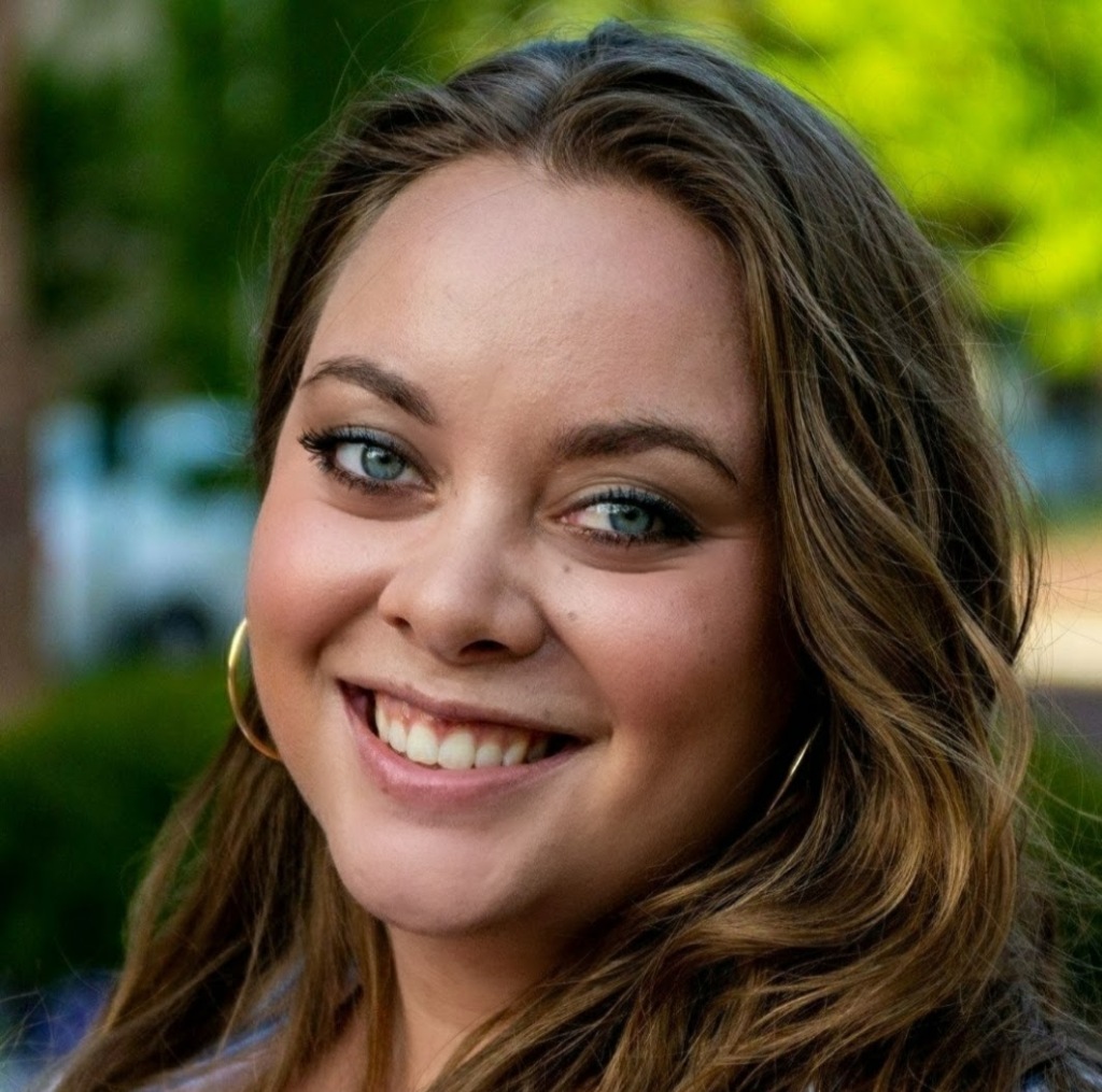
Dr. Andrea Love (Pennsylvania) and Dr. Jessica Steier (Florida). Photo credit: Josh Pelta-Heller
As the only nominee team of our all our nominees, both Dr. Andrea Love (Pennsylvania) and Dr. Jessica Steier (Florida) would independently be finalists in our professionals and/or specialists cohort if we split them up.
We chose to select Dr. Love and Dr. Steier as a team in our finalists cohort because of their joint commitment to public information during COVID-19 through their weekly Unbiased Science podcast.
From Dr. Jessica Steier:
“I am a public health data scientist with expertise in health policy evaluation and advanced data analytics to support population health improvement efforts. I’m the co-founder and CEO of Vital Statistics Consulting– a woman-owned public health data analytics firm engaged in projects such as the mix-methods evaluation of a statewide comprehensive primary care initiative in a midwestern state. “
“Most relevant to the pandemic, I designed and led a SARS-CoV-2 serosurvey for one of the largest FQHCs in the country, for which I am also developing a COVID-19 data dashboard. I am currently leading research on disparities in COVID-19 test positivity and vaccine uptake across different sociodemographic groups and subpopulations, as well as investigating impacts on other COVID and non-COVID related outcomes such as healthcare utilization, changes in preventive and wellness visits, and long-term outcomes.
“I launched the Unbiased Science Podcast, which I co-host with my brilliant immunologist colleague, Dr. Andrea Love, which aims to translate and communicate scientific research to the general public. Lastly, I teach coursework in biostatistics and epidemiology to clinical students with the goal of emphasizing the importance of the critical appraisal of evidence and life-long learning.”
From Dr. Andrea Love:
“I am an immunologist and microbiologist previously from academic research who currently works full-time in the biotech industry on research and assay development for cancer biology, immunotherapy, vaccine research and development, and other fields. “
“Science literacy and education is a passion of mine, and I’ve sought out other opportunities throughout my career to serve as a resource and subject matter expert to promote access to credible science. Once the pandemic started, I felt an obligation as someone in the field to provide distilled explanations and information to the general public, especially with the real-time emergence of data that was shared (and often misinterpreted) by media outlets, government agencies, and other organizations around the world.”
“After some time doing this on my personal social media pages, I joined forces with an old college classmate, public health scientist Dr. Jess Steier, to form the Unbiased Science Podcast. We provide continuous updates on the pandemic – from the science behind the novel virus, mechanisms of infection and transmission, mitigation measures and evolving recommendations, tracking infection metrics, emergence of variants, demographics and distribution of morbidity and mortality, and of course the ongoing clinical trials and regulatory review of vaccines.”
“One of the unique aspects of our project is that we collate and provide data in multiple modalities in order to effectively tackle the spread of disinformation. We have a weekly podcast that covers an array of scientific topics, many of which are directly related to COVID-19, vaccine research and development, public health, and clinical trials. We have active presences on social media (Instagram, Facebook, and LinkedIn) where we create daily infographics, data summaries, and other updates related to the pandemic. “
“And finally, we are actively engaged with media outlets, and have been interviewed by Philly Magazine, NBC News, VeryWell, (as examples), in addition to penning our own op-Ed discussing the need for scientists to join forces with the media to spread credible data. It is a multi-pronged approach that is overcoming the dearth of reliable data amongst a sea of disinformation.”
A few words from those who nominated Dr. Andrea Love:
“Andrea has been on the frontlines of the fight against coronavirus doing vaccine research. She uses her personal time to educate the community on the pandemic and best ways to stay safe, and is always available to answer everyone’s questions. She is a tireless advocate for real science and believes passionately in providing the public with honest and accurate information. Though she is frequently attacked by deniers/hoaxers, she engages them in a professional manner and remains grounded in facts and science in providing counterpoints. She is an inspiration to everyone around her and deserves to be recognized for the front-liner, first-responder, and champion of science that she is.”
“Dr. Andrea Love and is devoted to objective, critical appraisal of available evidence on science and health-related topics relevant to listeners’ daily lives.”
A few words from those who nominated Dr. Jessica Steier:
“Dr. Steier has worked tirelessly since the beginning of the pandemic. She launched a podcast (Unbiased Science) and social media page aimed at scientific communication for the general public in an attempt to make science more accessible. She is a public health scientist, applied statistician, and health policy expert by training but somehow managed to translate research in a way that is understandable for all. As CEO of Vital Statistics Consulting, she has also designed and led COVID-related research looking at test positivity rates across different subpopulations with an emphasis on the underserved. She has also led a multi-day summit with other experts in the field to translate COVID science, as well as a panel with faith-based leaders of contained communities aimed at combatting distrust of science and the medical establishment. She does all of this while being a mother to two young children and juggling lots of matters in her personal life. She is a real data shero!”
“Jessica has persisted relentlessly since the onset of the pandemic to educate and inform without insult or judgement about everything COVID. She has responded instantly to rumors with scientific fact and answered questions before we even knew we had them. She has aligned and acknowledged, empathized and sympathized always with passion and compassion yet never compromising her ultimate goal to educate based on fact.”
Rachel Woodul is a PhD Student in the Department of Geography and a Research Assistant at the Carolina Population Center at the University of North Carolina at Chapel Hill.
Rachel’s research interests include epidemic modeling, disease ecology, and infectious diseases, with a particular focus on pandemic influenza.
She employs geographic information systems (GIS), spatio-statistical and epidemiological analysis, and ecological frameworks to understand transmission dynamics and population-level impacts of epidemics and pandemics.
Her recent research has focused on simulating the 1918 Spanish Flu pandemic in a modern population, pandemic hospital capacity modeling, and modeling vulnerability to mortality during a pandemic.
“I work as part of the NCCOVID-19 team with Dr. Paul Delamater at the University of North Carolina at Chapel Hill. NC COVID-19 provides up-to-date estimates and future forecasts of SARS-CoV-2 infections, COVID-19 cases, and (coming soon) COVID-19-related hospitalizations and deaths in North Carolina.
“We created this site largely because we were unable to locate information about SARS-CoV-2 and COVID-19 in North Carolina that we thought was important for understanding past, current, and future transmission and risk,” Rachel said. “I believe the most important aspect of this project is making epidemiological data available to the public in ways that are both easily understandable and useful for gauging risk. What we know about this pandemic changes every day, so we update the site every day to ensure that North Carolinians have access to the most up-to-date information about things that matter to them, like transmission in school districts and rates of vaccination.”
A few words from those who nominated Rachel:
“Rachel is basically running the only resource for COVID-19 in NC, and I honestly don’t know where we’d be without her!”
We are working to complete our profiles for the more than 500 nominees submitted during the month of February. If you’d like to add to this profile, please email us at: Contact@Data-Usa.org
“I have a demonstrated record of collaborative research, scholarly publication, teaching and advising, and participation in public health organizations and professional associations” Jason writes on his website.
“I have amassed a substantial and versatile proficiency in database development, data linkage, management, and analysis, program and systems evaluation, community engagement, and information dissemination. I am a passionate public health professional committed to solving problems and creating conditions that enable people to lead healthy, productive lives.”
Jason built a reputation in Florida as an honest, transparent and vigilant reporter of data and trends through his website and Twitter feed. Jason makes all of his data available to the public for free, and has invested countless hours in keeping Florida honest, never deterred by anti-mask, anti-vaccines and pro-government harassment. His commitment to data access, transparency and data visualization may be unmatched in the state of Florida.
“Dr. Salemi is consistent, transparent, dependable, creative, and trustworthy.”
“Non partisan data. Responsive to requests. The best in the state. Doing it for nothing but to inform.”
“With all the misinformation out there and cover-ups in our state and by our governor, Florida is lucky to have so many data heroes like Jason and Rebekah out there. They give us the truth when the government won’t!”
We are working to complete our profiles for the more than 500 nominees submitted during the month of February. If you’d like to add to this profile, please email us at: Contact@Data-Usa.org
Andy Flach (Arizona)
“I have always loved spreadsheets and tracking data in order to gain insights into complicated phenomena, so when the pandemic started I began transcribing and charting Arizona Department of Health Services Covid-19 data in order to get a better sense of the progression of the pandemic in Arizona, and to keep a record of the data and how it changed over time (the ADHS data dashboard doesn’t have an option to download data). Then I started sharing my charts, and a link to a Google Sheet with the data, on the Tucson Coronavirus Facebook group and on Twitter, figuring as long as I was doing this work for my own curiosity I might as well share it in case anyone else was interested. My overall goal in all this has been to really “see” the pandemic and try and get a sense of how it works.”
Since the beginning of the COVID-19 pandemic, Philip Nelson has collected data and informed South Carolinians about the virus in their state.
In March 2020, Nelson started a simple spreadsheet to collect daily data, but then quickly realized that he could use his computer science background to automate his work and expand the resources he provided.
Starting off, he didn’t know much about working with data or using code, but over time that changed.
He wrote scripts and learned to use data tools and libraries to help visualize the data, and then he started posting the information to his Twitter.
Over several months he learned how to use programming to pull large amounts of data from SC DHEC, visualize it, and then post it to twitter all within seconds of the data going live.
His work has garnered attention from state legislators. local media, and public health researchers.
“I care about accurately presenting the data in an accessible manner, and I want everyone to have access to data,” Nelson said. “Because DHEC doesn’t accessibly provide downloadable case history for the state and its counties, I provide CSVs and graphs of this data on my website.”
Philip has worked hard and learned many things in order to become a reliable source for South Carolina COVID19 data.
A few words from those who nominated Philip:
“As an investigative reporter his datasets have provided me leads on stories I wasn’t even thinking about, particularly the scale of COVID outbreak in South Carolina prisons. His willingness to push through and find new ways of analyzing data particularly in a rural southern state is unlike anything else I’ve seen.”
“I’m a retired biostatistician. When the pandemic hit, I started tracking SCDHEC data on my own. As soon as I found Philip’s data tracking, I quit doing my own. Philip posts summaries, points out trends, and presents it all in clear graphics, usually within minutes of SCDHEC’s daily data release. He points out inconsistencies in the official data, and does a better job than SCDHEC explaining the quirks in data collection. He does all this on his own time, while a full-time student at Winthrop. He has a knack for digging into data and turning it into user-friendly graphics, and the drive to get through the many technical issues of automating the process. He has a bright future ahead.”
The White House COVID-19 outbreak tracker became one of the most illustrative data pieces of the failure of the Trump administration in handling the pandemic.
The 21-year-old college senior behind the project started collecting that data out of curiosity on a piece of paper after Donald Trump tested positive last October.
Not long after, Benjy Renton’s other COVID-19 data projects and maps were being shared across the world, informing decision makers and driving national discussions about school reopening and more – work he had been doing throughout the pandemic.
“It snowballed into a much larger project that started initially with the first White House outbreak.. and went into December,” he said.
Benjy tracks cases in universities, too. And he tracks which counties in the United State are (or are not) meeting the CDC’s recently revised metrics for reopening schools safely.
In just a week, the United States has made great strides to reduce community transmission and help keep schools open. These two maps are based on the CDC's school reopening thresholds. While last Sunday >90% of kids were in the "red zone," now it is 74%.https://t.co/jzU25H8Nuqpic.twitter.com/ljpxzwc6zk
He was in China last January (2020) when news of the outbreak spread across the world. When he returned to the U.S., he was shocked to find how few measures were being taken. His work visualizing COVID-19 data started not long after. From tracking testing to outbreaks in higher education, Benjy worked to get the data out.
Someone said he should be hung during a Reddit “Ask me anything event.” Online harassment comes with COVID-19 communication, no matter how much the source sticks to the data.
“The raw numbers don’t lie,” he said. “You can use the numbers to lie, but the raw numbers don’t lie. It’s important for people to understand exactly what is happening.”
A few words from those who nominated Benjy:
“Benjy has been doing basically everything since the pandemic started, from contact tracing the White House to making accessible visualizations of vaccine rollout to writing a weekly newsletter summarizing all of the relevant new Covid information from that week. I can’t point to any single person and objectively say he saved their life, but I have no doubt that his data work has gotten thousands of people through the pandemic well-informed, well-protected, and maybe even a little less lonely. And he’s been doing all of this on top of a full course load from a NESCAC.”
“Benjy Renton has done a remarkable job at collating information about the pandemic, both nationally and with specific focuses on higher ed, the White House, and Vermo nt. His weekly newsletters have done an incredible job at summarizing the state of higher ed and the country on a weekly basis. His various projects and even his Twitter feed have been fantastic, thorough, and all-encompassing sources of analysis on the pandemic and its effects. His skilled data interpretation and visualizations have been outstanding. He’s perhaps known most widely for his incredible trackers on COVID cases in colleges and the White House, vaccine distribution, and more–some of which he established far before other news sources attempted something similar. The most remarkable element of Benjy Renton’s work is that he’s not a scientist, or a professional journalist, but a college student. His work is driven not by professional obligation but by care and interest, yet it exceeds that of professionals.”
Dr. Theresa Chapple has dedicated the last 13 months to combating misinformation about COVID-19, building her science communication skills to teach the public about Covid-19 prevention approaches, and advocating for data-driven public policy to address the pandemic.
Since June, she’s worked with 27 school districts across the country to aid in Covid-19 data and research interpretation, setting data related metrics for reopening and closings, and identifying and training on risk mitigation approaches.
She has also utilized platforms such as social media and traditional media to share public health prevention messages and translate research into language understandable by the masses.
Her thought-provoking and thoroughly researched messages on school reopening challenged narratives being pushed by economists who intentionally misled the public about the risks associated with in-person learning during the pandemic.
She breaks the data down, offers analysis and context, and is one of the most responsive experts for COVID-19 information on Twitter.
“There’s a reason Dr. Chapple put this [COVID-19 outbreaks in schools and childcare settings] exhaustingly long list together, and why it’s still growing,” Karen Johnson wrote in Yahoo! News last August. “She wants us to realize and truly understand that this is what happens when people gather in groups. When adults gather in groups. When teens gather in groups. And when children gather in groups. Camps, daycare centers, and how it will be schools.”
A few words from those who nominated Dr. Chapple:
“Dr. Chapple may be the most courageous woman I’ve encountered during the COVID-19 pandemic. She unabashedly challenges misinformation in a confident and assertive way that doesn’t come off as talking down to people.”
“When a lot of junk science about schools came out from people with no subject-matter expertise, Dr. Chapple confronted them with the realities of what the real science and data showed, and by doing so likely saved many lives.”
As a Stanford University physician with more than a decade of experience working with health data, Dr. Jorge Caballero could easily fit into both the specialists and the professionals groups of our awards program. His work during COVID-19 would indeed make him a finalist in either of those cohorts.
Dr. Jorge Caballero
Dr. Caballero’s advocacy for data access and transparency, and his continued commitment to communicating the racial and ethnic disparities in testing, cases and vaccinations shown in the data, makes him stand out as a Provocateur.
In March 2020, Dr. Caballero cofounded Coders against Covid, a volunteer group that builds tech solutions to address the most pressing needs of those affected by COVID-19, challenging his local, state and federal officials to step up.
Dr. Caballero built the first nation-wide COVID-19 testing site directory in mid-March 2020, before most states even had comprehensive lists of their own testing site facilities.
Shortly thereafter, Coders against Covid joined FEMA’s crowdsourcing initiative, and were connected with GISCorps, a volunteer group of geospatial information specialists. The partnership built the most comprehensive database of COVID-19 testing locations in the country, providing maps and tools to find your nearest testing site, operations hours, appointment scheduling, and more.
Dr. Caballero also uses the power of his position and his Twitter account to share data and information about the state of Coronavirus in California and across the country on a daily basis. He keeps up with data in Arizona and Nevada, even sharing the work of our other COVID-19 Data Hero Award nominees:
“Of course, all that flies out the window when it comes to extended contact that’s unmasked, as one might expect from, say, outdoor dining. It’s exactly that paradox that prompted an angry tweetstorm from Stanford doctor Jorge A. Caballero, who says that “The data does NOT support lifting restrictions— this would be Newsom caving to political pressure, again,” perhaps referring to an anti-vaccination/Republican-led recall effort against the governor. Caballero warns that even now, the devastating surge in Southern California “is moving up the state: through the central valley and into the SF Bay Area.”
When California spent $62.5 million on a contract with Verily – a subsidiary of Google parent company Alphabet – which led Trump to erroneously claim Google was building a site to help Americans find testing locations (a site Dr. Caballero would end up creating), Dr. Caballero stepped up and spoke out.
But the [Verily] partnership has also faced criticism from public health experts from the start, and left some elected officials in California frustrated by what they describe as a misguided approach to testing vulnerable communities.
Dr. Jorge Caballero, a Stanford physician and co-founder of the public testing database Coders against COVID, began warning CDPH contacts in April that poorer areas remained underserved by state testing sites. As he fielded requests in Spanish for help with the platform, it seemed that Verily wasn’t “nimble enough to address the demand and the evolution of the demand,” Caballero said.
“This whole strategy was just sort of backwards from the get-go,” Caballero said. “Why were we spending this money if it wasn’t solving problems, and it was creating additional problems?”
Not one to play partisan politics, Dr. Caballero calls out, defends, and makes policy recommendations to all of the science and data-backed decisions made across the country. His advocacy, insight and persistent communications about what the data tells us has impacted communities across the country, saving countless lives in the process.
Moreover, the more populous states (e.g. CA, TX, FL, NY) have pockets of very, very high population density— which makes it easier to reach many people in one fell swoop:
🔸25% of all Californians live in LA County 🔸44% of NY state residents live in NYC pic.twitter.com/rfTvUaHD0m
A few words from those who nominated Dr. Caballero:
“If everyone would have just listened to him from the start, we would all be so much better off. California has made little effort to work with Hispanic communities, to communicate data with us regularly. It’s like we don’t matter. We’re dying and we don’t matter. The only person who seems to care is the doctor.” [Note: This submission was translated from Spanish]
“Jorge’s reputation as a physician, a scientist, as the “Data-driven MD,” could not be over-stated. I’ve never met a man who has worked harder to ensure accurate information reaches the public, that the accurate information is advocated for, and that the activism results in meaningful discussion and, hopefully, policy change. No one else could possibly be more worthy of a Data Hero Award than Jorge Caballero.”
Non-White communities, which tend to be younger, are still waiting.
In California: Hispanic persons are 2.5X more likely to pass away from COVID-19 than their White counterparts but they are half as likely to have received at least 1 dose of the vaccine.