Chris Vanderveen isn’t a math guy. His spreadsheets are messy, at best. But at some point, in the late spring of 2020, he found himself trying to help people who wanted more than complicated charts and numbers.
They wanted context.
In essence, they wanted to know, “What’s it all mean?”
Chris, an investigative reporter at Denver’s KUSA-TV, turned his twitter account into a daily, one-stop shop for Coloradans interested in knowing more about what the virus was up to in the state.
There, generally around 4pm, people could get info on patient counts, case counts, positivity and deaths.
With the help of his ridiculously simple graphics (arrows drawn via mouse), Chris turned the state’s daily data dump into a way for people to watch and analyze the trends. His daily updates have turned into a daily watering hole monitored by state health officials and twitter newbies alike.
On Twitter, he’s snappy and sharp. He doesn’t tolerate nonsense, and gets a lot of flack for it. He promotes science and research, and engages in discussion with those seeking answers — while shutting down those who propagate fringe ideas. With his signature red-pen, talent for graphics and video, and propensity for facts, Chris delivers information the way it was meant to be — with honesty.
Headline: Flat. As flat as the can of root beer my ten year old left in the back seat of my car for more than a week before telling me about it. Yep. Happened.
We are working to complete our profiles for the more than 500 nominees submitted during the month of February. If you’d like to add to this profile, please email us at: Contact@Data-Usa.org
Dr. Emily Smith, who also goes by moniker “Your Friendly Neighbor Epidemiologist,” is an assistant professor of epidemiology at Baylor University. Her research focuses on pediatric epidemiology and global health, particularly in developing nations.
Dr. Smith began providing a forum — both on Facebook and through her website — for her neighbors to ask (and have answered) questions about COVID-19 last March (2020).
The project quickly bloomed from its humble origins, and Dr. Smith became a celebrated science communicator across Texas, with 71,420 followers on Facebook as of March 2, 20201.
She works on the principals of “Love thy neighbor,” and makes communicating pandemic data and risks about communities. She works to reach out to faith-based organizations and open dialogues about social responsibility, from the church where her husband is a pastor to more conservative-leaning religious organizations.
Like many of our nominees, Dr. Smith endures harassment for her efforts to bring data to the public. Last August, she remarked on the shift in tone.
“At the beginning, people just said thank you and by and large were appreciative of trying to figure out what the pandemic was,” Dr. Smith said in an interview with Baptist News. “The further we’ve gotten into it, there is a significant divide on people who are posting. I have to delete or hide most of them, because that is not the battle we are facing.”
The author also captured her personable and collaborative attitude, noting “…she wants to talk to anyone who will listen in her naturally friendly tone, like talking to a really smart neighbor who just might be the nicest person you ever met.”
A few words from those who nominated Dr. Emily Smith:
“Emily Smith has made epidemiology relevant and applicable to the “average Joe/Jane” with her moniker as “your friendly local epidemiologist” in an area of Texas with many Covid deniers. She accidentally garnered a large following of people who want to learn more and of people who are simply curious. Her style is kind, yet informative, and she has filled a needed communication gap during the pandemic. Hats off to Dr. Smith for reaching out to common folk on Facebook and figuring out how to engage and act on important ideas.”
“Dr. Smith has been teaching the public about COVID-19 and related issues through posts on Facebook and her website. She has been guiding her community of followers through the pandemic with science-based information stated clearly enough for laymen to follow. She has been able to be encouraging yet realistic without fail. People have learned to depend upon her to deliver accurate information which they can use in their personal health decision making. Dr. Smith has demonstrated devotion to humankind and dedication to the field of epidemiology. The countless hours which she has spent serving the public on these forums has been without compensation. She deserves to be recognized for her exemplary work.”
“Dr. Smith has become one of my favorite resources for info about COVID-19 and the vaccines. She does a wonderful job of explaining data to non-experts in ways that are easy to understand and relatable, and always includes links to original data sources and articles. While Facebook has been her primary platform, she shares most of her posts on her website to increase accessibility. I’ve appreciate that she also sometimes speaks not only as an epidemiologist, but also as part of a religious community who has struggled with people not believing in/following the science; she has clearly addressed many myths, has endured personal criticism and threats, and has worked to support religious leaders that are seeking to serve their communities who may have opposing views. Though all of this, she has lived up to her nickname of Friendly Neighbor Epidemiologist!”
*Acronym definitions to know: GIS (Geographic Information Science), ESRI (Environmental Systems Research Institute), WGIS (Women in GIS)
Carley Fitzgerald (Florida)
Carley Fitzgerald is a geographer and GIS expert from Highlands County, Florida, who’s dedicated, innovative and bold leadership in Florida changed how experts approached issues of geospatial epidemiology across the country.
In March 2020, Carley began working in the COVID-19 Information & Planning Section of the Highlands County Emergency Operations Center. A study released by ESRI around that time warned that Highlands was one of the most vulnerable in the nation, so Carley quickly got to work.
She worked on everything from sourcing, managing and analyzing data, to epidemiological modeling, to application development and public outreach.
“It is my hope that by providing the data, analysis, applications, and more to the County we were able to better prepare and respond to COVID-19 in our County despite our higher-than-average vulnerability to the virus,” said Carley.”
She built an application for residents to sign up for a waitlist when the state failed to provide the resources to do so, supporting her community’s access to information about vaccine distribution.
“As a geographer, I am familiar with sourcing, managing, and analyzing data,” said Carley. “I was able to quickly get to work learning GIS epidemiology models and providing key metrics regarding the status of COVID-19 in our County and State to Emergency Managers and Administration.”
Her role in managing the crisis for her community extended to advocating for data access across the country. A champion for women’s equality in advanced sciences, she was also elected to serve on the the board of Women in GIS (WGIS), an international non-profit and professional organization.
“The aim of WIGIS is to serve as a safe place for women from all geospatial fields to work towards overcoming things like: job discrimination, lower pay, professional isolation, and other common barriers women might face,” said Carley.
She currently serves as the lead for the professional development committee for WGIS, as well.
“It was especially important for me to join the organization, and now volunteer my time with WIGIS because GIS, as with pretty much most other sciences and technology fields, are very male dominated” said Carley. “Most GIS Departments are relatively small and that leaves many women in a unique position where they are the only woman in the department.”
“I worked with a colleague to develop a number of virtual events that help women in the GIS field advance their careers. We also developed a webinar series called Women in GIS Careers. We know that in a field that is male dominated representation matters and we are using the platform of our webinars to highlight successful women in GIS and their accomplishments in their field while they share how they got to their current role. We commonly speak about issues like imposter syndrome, where sometimes you just feel like you don’t belong in the role you have. Hearing these successful women speak about overcoming similar hurdles is reassuring and helps us to all know we are capable and not alone in our struggles.”
Examples of Carley’s work are submitted below.
An “At-A-Glance” Dashboard for Emergency Managers This dashboard was created as a quick way to determine the condition in regional hospitals, our own bed availability, currently active cases and more.
Tracked Vaccine Rollout and Distribution Patterns One of the priorities that I consider especially important for vaccine rollout are areas with high concentrations of currently active COVID-19 cases per capita. So I compare the per capita estimated current active cases for all the counties in Florida to their % of the population fully vaccinated. After highlighting the top 5 counties and Highlands in each graph you can see that they are negatively corelated. In fact, 6 of the 7 lowest fully vaccinated counties in Florida are all located in the Heartland region of Florida. Highlands County on this week was also high in concentrations of current active cases. This information is useful for advocating for increased vaccine allotment.
Weekly Trend Graphs for the County and State These graphics were great at illustrating the progression of COVID-19 in our county and were shared at County Commissioner meetings with the public.
Tracked Hospital Bed Availability Over Time In June I started tracking hospital bed and ICU bed availability in our county and in the state to provide a better perspective on the condition of the hospitals.
Calculated Senior Case Death and Case Hospitalization Rates for Our County and State. Our county has consistently had a case hospitalization and case death rate that was higher than the rates of the state. This was important for future projections of COVID-19 conditions in our County. After determining an accurate case death and case hospitalization rate, I applied the CDC guidance for average time a new case takes to end up in the hospital and potentially succumb to the virus. This allowed me to project out new hospitalizations, and new deaths based on current case load.
One of the first things we knew about the virus was that it was more deadly to the older generations. I use state data to calculate how deadly by finding the case death rates based on smaller age brackets. Awareness of this metric puts just how perilous outbreaks can be in senior communities like ours.
Vaccination I also assisted with the vaccination process by creating an online application that members of the public could register for a vaccine waitlist. In the one month the website was live before the state provided a solution to the public, is accumulated over 100,000 page views and 0ver 30,000 registrations. Not too shabby for a county that has a population of about 105,000.
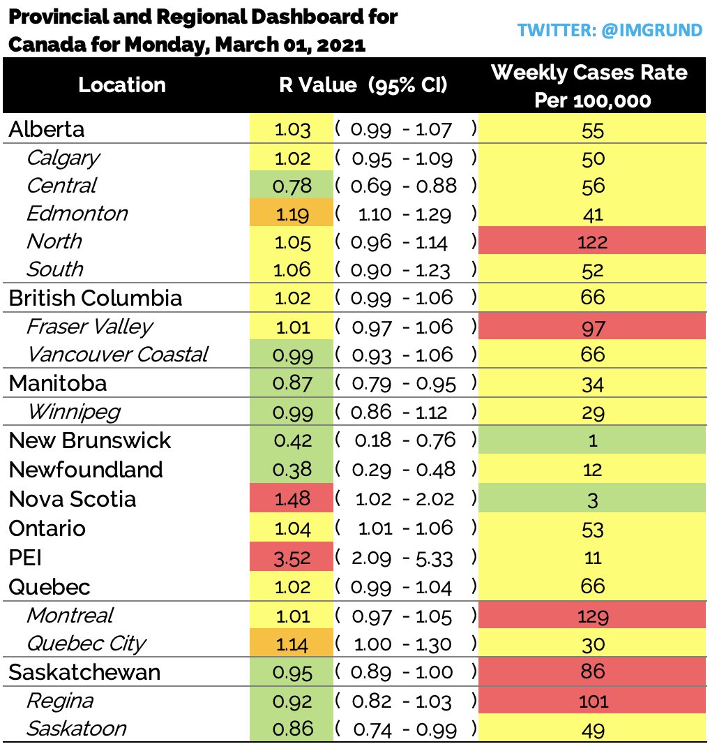
In March 2020, Ryan was a biostatistician at Southlake Regional Health Center in Newmarket, Ontario where he was in charge of creating a model to predict future ICU utilization. The one value found to be predictive in nature was the effective reproductive value (Rt). Due to Ryan’s past experience at the Public Health Agency of Canada, it was a value he was able to calculate.
In May of 2020, Ryan shifted gears when he realized that this important metric, used throughout Europe, was referred to by the Province of Ontario constantly but it’s value was never publicly released.
In the summer of 2020, Ryan extended his Rt calculations to include all 34 public health units in Ontario, Canada. This extension proved extremely beneficial when the Province of Ontario included the Rt value in their “regional framework” but still did not release the value publicly.
In the fall of 2020 Ryan departed from Southlake and started working independently. He realized the “hiding” of this value wasn’t just an Ontario problem; in fact, it happened throughout Canada. He shifted gears and started providing this value for every large Canadian province as well as all urban centers.
This value is updated on his Twitter profile (@imgrund) every morning. He has not missed a daily update since May 2020. The value of Ryan’s effective reproductive number calculations was further elevated when several public health units in Ontario started using both his values and his methods, including Ottawa Public Health.
March 1 post on case rates and reproduction rate of COVID-19 in Canadian provinces and select cities, published on Ryan’s Twitter feed here.
“Currently, I am the only person reporting regional effective reproductive values (Rt) in Ontario, a metric that is being used by our Government to re-open our Province. No one else releases this value, not even our Government,” Ryan said. “I have expanded this and now release the Rt for EVERY Canadian Province and EVERY major Canadian city – EVERY morning at 8:00 EST. I am a biostatistician, who works with several major public health units, including Ottawa, Ontario Canada, and Six Nations, an indigenous community in Ontario. My full-time job is a high-school science teacher in the Greater Toronto Area.”
Aside from publishing this important metric on a daily basis for all Canadians, he also publishes a personal risk assessment by region, school-based cases, and global case counts. He has become the go-to source for Canadian Covid content not just by the people of Canada, but by several health units including Peel Public Health and Six Nations Health Services.
A few words from those who nominated Ryan:
“High school teacher by day, also biostatistician by day, and also COVID-19 resource by day… I’m not sure how he fits it all in, but he is definitely one of Canada’s date heroes!”
The Professionals Cohort (Pennsylvania and Florida)
This is an abbreviated version of our interview. The full interview will be uploaded in the near future.
Dr. Andrea Love (Pennsylvania) and Dr. Jessica Steier (Florida). Photo credit: Josh Pelta-Heller
As the only nominee team of our all our nominees, both Dr. Andrea Love (Pennsylvania) and Dr. Jessica Steier (Florida) would independently be finalists in our professionals and/or specialists cohort if we split them up.
We chose to select Dr. Love and Dr. Steier as a team in our finalists cohort because of their joint commitment to public information during COVID-19 through their weekly Unbiased Science podcast.
From Dr. Jessica Steier:
“I am a public health data scientist with expertise in health policy evaluation and advanced data analytics to support population health improvement efforts. I’m the co-founder and CEO of Vital Statistics Consulting– a woman-owned public health data analytics firm engaged in projects such as the mix-methods evaluation of a statewide comprehensive primary care initiative in a midwestern state. “
“Most relevant to the pandemic, I designed and led a SARS-CoV-2 serosurvey for one of the largest FQHCs in the country, for which I am also developing a COVID-19 data dashboard. I am currently leading research on disparities in COVID-19 test positivity and vaccine uptake across different sociodemographic groups and subpopulations, as well as investigating impacts on other COVID and non-COVID related outcomes such as healthcare utilization, changes in preventive and wellness visits, and long-term outcomes.
“I launched the Unbiased Science Podcast, which I co-host with my brilliant immunologist colleague, Dr. Andrea Love, which aims to translate and communicate scientific research to the general public. Lastly, I teach coursework in biostatistics and epidemiology to clinical students with the goal of emphasizing the importance of the critical appraisal of evidence and life-long learning.”
From Dr. Andrea Love:
“I am an immunologist and microbiologist previously from academic research who currently works full-time in the biotech industry on research and assay development for cancer biology, immunotherapy, vaccine research and development, and other fields. “
“Science literacy and education is a passion of mine, and I’ve sought out other opportunities throughout my career to serve as a resource and subject matter expert to promote access to credible science. Once the pandemic started, I felt an obligation as someone in the field to provide distilled explanations and information to the general public, especially with the real-time emergence of data that was shared (and often misinterpreted) by media outlets, government agencies, and other organizations around the world.”
“After some time doing this on my personal social media pages, I joined forces with an old college classmate, public health scientist Dr. Jess Steier, to form the Unbiased Science Podcast. We provide continuous updates on the pandemic – from the science behind the novel virus, mechanisms of infection and transmission, mitigation measures and evolving recommendations, tracking infection metrics, emergence of variants, demographics and distribution of morbidity and mortality, and of course the ongoing clinical trials and regulatory review of vaccines.”
“One of the unique aspects of our project is that we collate and provide data in multiple modalities in order to effectively tackle the spread of disinformation. We have a weekly podcast that covers an array of scientific topics, many of which are directly related to COVID-19, vaccine research and development, public health, and clinical trials. We have active presences on social media (Instagram, Facebook, and LinkedIn) where we create daily infographics, data summaries, and other updates related to the pandemic. “
“And finally, we are actively engaged with media outlets, and have been interviewed by Philly Magazine, NBC News, VeryWell, (as examples), in addition to penning our own op-Ed discussing the need for scientists to join forces with the media to spread credible data. It is a multi-pronged approach that is overcoming the dearth of reliable data amongst a sea of disinformation.”
A few words from those who nominated Dr. Andrea Love:
“Andrea has been on the frontlines of the fight against coronavirus doing vaccine research. She uses her personal time to educate the community on the pandemic and best ways to stay safe, and is always available to answer everyone’s questions. She is a tireless advocate for real science and believes passionately in providing the public with honest and accurate information. Though she is frequently attacked by deniers/hoaxers, she engages them in a professional manner and remains grounded in facts and science in providing counterpoints. She is an inspiration to everyone around her and deserves to be recognized for the front-liner, first-responder, and champion of science that she is.”
“Dr. Andrea Love and is devoted to objective, critical appraisal of available evidence on science and health-related topics relevant to listeners’ daily lives.”
A few words from those who nominated Dr. Jessica Steier:
“Dr. Steier has worked tirelessly since the beginning of the pandemic. She launched a podcast (Unbiased Science) and social media page aimed at scientific communication for the general public in an attempt to make science more accessible. She is a public health scientist, applied statistician, and health policy expert by training but somehow managed to translate research in a way that is understandable for all. As CEO of Vital Statistics Consulting, she has also designed and led COVID-related research looking at test positivity rates across different subpopulations with an emphasis on the underserved. She has also led a multi-day summit with other experts in the field to translate COVID science, as well as a panel with faith-based leaders of contained communities aimed at combatting distrust of science and the medical establishment. She does all of this while being a mother to two young children and juggling lots of matters in her personal life. She is a real data shero!”
“Jessica has persisted relentlessly since the onset of the pandemic to educate and inform without insult or judgement about everything COVID. She has responded instantly to rumors with scientific fact and answered questions before we even knew we had them. She has aligned and acknowledged, empathized and sympathized always with passion and compassion yet never compromising her ultimate goal to educate based on fact.”
Rachel Woodul is a PhD Student in the Department of Geography and a Research Assistant at the Carolina Population Center at the University of North Carolina at Chapel Hill.
Rachel’s research interests include epidemic modeling, disease ecology, and infectious diseases, with a particular focus on pandemic influenza.
She employs geographic information systems (GIS), spatio-statistical and epidemiological analysis, and ecological frameworks to understand transmission dynamics and population-level impacts of epidemics and pandemics.
Her recent research has focused on simulating the 1918 Spanish Flu pandemic in a modern population, pandemic hospital capacity modeling, and modeling vulnerability to mortality during a pandemic.
“I work as part of the NCCOVID-19 team with Dr. Paul Delamater at the University of North Carolina at Chapel Hill. NC COVID-19 provides up-to-date estimates and future forecasts of SARS-CoV-2 infections, COVID-19 cases, and (coming soon) COVID-19-related hospitalizations and deaths in North Carolina.
“We created this site largely because we were unable to locate information about SARS-CoV-2 and COVID-19 in North Carolina that we thought was important for understanding past, current, and future transmission and risk,” Rachel said. “I believe the most important aspect of this project is making epidemiological data available to the public in ways that are both easily understandable and useful for gauging risk. What we know about this pandemic changes every day, so we update the site every day to ensure that North Carolinians have access to the most up-to-date information about things that matter to them, like transmission in school districts and rates of vaccination.”
A few words from those who nominated Rachel:
“Rachel is basically running the only resource for COVID-19 in NC, and I honestly don’t know where we’d be without her!”
Since the beginning of the COVID-19 pandemic, Philip Nelson has collected data and informed South Carolinians about the virus in their state.
In March 2020, Nelson started a simple spreadsheet to collect daily data, but then quickly realized that he could use his computer science background to automate his work and expand the resources he provided.
Starting off, he didn’t know much about working with data or using code, but over time that changed.
He wrote scripts and learned to use data tools and libraries to help visualize the data, and then he started posting the information to his Twitter.
Over several months he learned how to use programming to pull large amounts of data from SC DHEC, visualize it, and then post it to twitter all within seconds of the data going live.
His work has garnered attention from state legislators. local media, and public health researchers.
“I care about accurately presenting the data in an accessible manner, and I want everyone to have access to data,” Nelson said. “Because DHEC doesn’t accessibly provide downloadable case history for the state and its counties, I provide CSVs and graphs of this data on my website.”
Philip has worked hard and learned many things in order to become a reliable source for South Carolina COVID19 data.
A few words from those who nominated Philip:
“As an investigative reporter his datasets have provided me leads on stories I wasn’t even thinking about, particularly the scale of COVID outbreak in South Carolina prisons. His willingness to push through and find new ways of analyzing data particularly in a rural southern state is unlike anything else I’ve seen.”
“I’m a retired biostatistician. When the pandemic hit, I started tracking SCDHEC data on my own. As soon as I found Philip’s data tracking, I quit doing my own. Philip posts summaries, points out trends, and presents it all in clear graphics, usually within minutes of SCDHEC’s daily data release. He points out inconsistencies in the official data, and does a better job than SCDHEC explaining the quirks in data collection. He does all this on his own time, while a full-time student at Winthrop. He has a knack for digging into data and turning it into user-friendly graphics, and the drive to get through the many technical issues of automating the process. He has a bright future ahead.”
The White House COVID-19 outbreak tracker became one of the most illustrative data pieces of the failure of the Trump administration in handling the pandemic.
The 21-year-old college senior behind the project started collecting that data out of curiosity on a piece of paper after Donald Trump tested positive last October.
Not long after, Benjy Renton’s other COVID-19 data projects and maps were being shared across the world, informing decision makers and driving national discussions about school reopening and more – work he had been doing throughout the pandemic.
“It snowballed into a much larger project that started initially with the first White House outbreak.. and went into December,” he said.
Benjy tracks cases in universities, too. And he tracks which counties in the United State are (or are not) meeting the CDC’s recently revised metrics for reopening schools safely.
In just a week, the United States has made great strides to reduce community transmission and help keep schools open. These two maps are based on the CDC's school reopening thresholds. While last Sunday >90% of kids were in the "red zone," now it is 74%.https://t.co/jzU25H8Nuqpic.twitter.com/ljpxzwc6zk
He was in China last January (2020) when news of the outbreak spread across the world. When he returned to the U.S., he was shocked to find how few measures were being taken. His work visualizing COVID-19 data started not long after. From tracking testing to outbreaks in higher education, Benjy worked to get the data out.
Someone said he should be hung during a Reddit “Ask me anything event.” Online harassment comes with COVID-19 communication, no matter how much the source sticks to the data.
“The raw numbers don’t lie,” he said. “You can use the numbers to lie, but the raw numbers don’t lie. It’s important for people to understand exactly what is happening.”
A few words from those who nominated Benjy:
“Benjy has been doing basically everything since the pandemic started, from contact tracing the White House to making accessible visualizations of vaccine rollout to writing a weekly newsletter summarizing all of the relevant new Covid information from that week. I can’t point to any single person and objectively say he saved their life, but I have no doubt that his data work has gotten thousands of people through the pandemic well-informed, well-protected, and maybe even a little less lonely. And he’s been doing all of this on top of a full course load from a NESCAC.”
“Benjy Renton has done a remarkable job at collating information about the pandemic, both nationally and with specific focuses on higher ed, the White House, and Vermo nt. His weekly newsletters have done an incredible job at summarizing the state of higher ed and the country on a weekly basis. His various projects and even his Twitter feed have been fantastic, thorough, and all-encompassing sources of analysis on the pandemic and its effects. His skilled data interpretation and visualizations have been outstanding. He’s perhaps known most widely for his incredible trackers on COVID cases in colleges and the White House, vaccine distribution, and more–some of which he established far before other news sources attempted something similar. The most remarkable element of Benjy Renton’s work is that he’s not a scientist, or a professional journalist, but a college student. His work is driven not by professional obligation but by care and interest, yet it exceeds that of professionals.”
Dr. Theresa Chapple has dedicated the last 13 months to combating misinformation about COVID-19, building her science communication skills to teach the public about Covid-19 prevention approaches, and advocating for data-driven public policy to address the pandemic.
Since June, she’s worked with 27 school districts across the country to aid in Covid-19 data and research interpretation, setting data related metrics for reopening and closings, and identifying and training on risk mitigation approaches.
She has also utilized platforms such as social media and traditional media to share public health prevention messages and translate research into language understandable by the masses.
Her thought-provoking and thoroughly researched messages on school reopening challenged narratives being pushed by economists who intentionally misled the public about the risks associated with in-person learning during the pandemic.
She breaks the data down, offers analysis and context, and is one of the most responsive experts for COVID-19 information on Twitter.
“There’s a reason Dr. Chapple put this [COVID-19 outbreaks in schools and childcare settings] exhaustingly long list together, and why it’s still growing,” Karen Johnson wrote in Yahoo! News last August. “She wants us to realize and truly understand that this is what happens when people gather in groups. When adults gather in groups. When teens gather in groups. And when children gather in groups. Camps, daycare centers, and how it will be schools.”
A few words from those who nominated Dr. Chapple:
“Dr. Chapple may be the most courageous woman I’ve encountered during the COVID-19 pandemic. She unabashedly challenges misinformation in a confident and assertive way that doesn’t come off as talking down to people.”
“When a lot of junk science about schools came out from people with no subject-matter expertise, Dr. Chapple confronted them with the realities of what the real science and data showed, and by doing so likely saved many lives.”